Point and Shoot: reality “reproduced” or reality “rendered”?

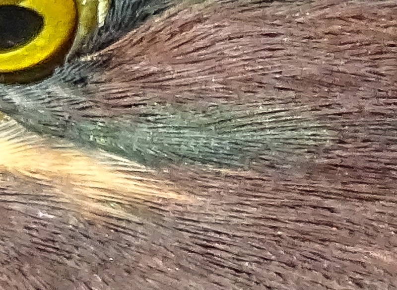
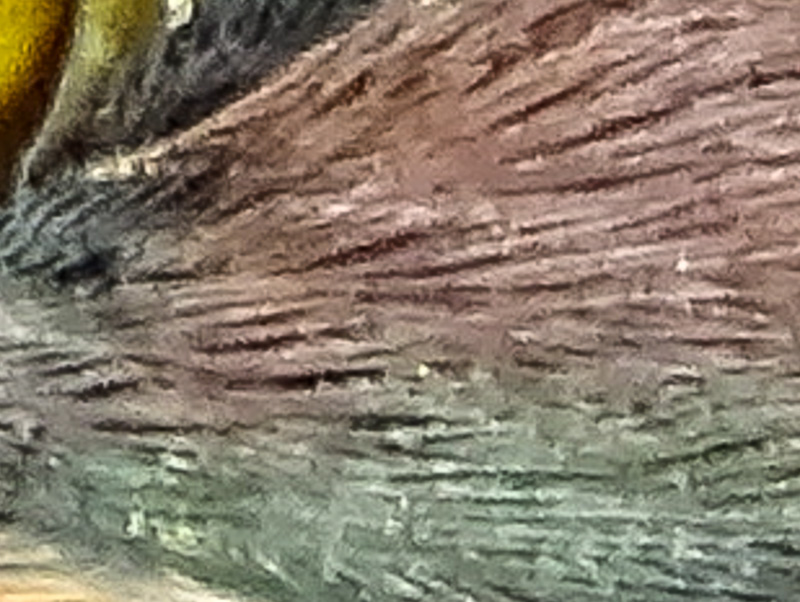
Anhinga wing. Florida. Sony HX400V

Photo geek discussions of image quality often revolve around the presence or absence of artifacts in the image when viewed at high resolution and large sizes. The theory among serious photographers seems to be that a good digital image should have very few visible artifacts, no matter how big you blow it up.

Digital artifacts come in several flavors. One of the more obvious ones is color, tone, and detail smearing, often referred to as the water-color-effect. In areas of the image with very fine visible detail the colors tend to run together in a muddy mix, and fine detail looks smeared as though a wet brush had been dragged across it. This is especially evident in grass at distance and at the edges of the frame and foliage. Then there is postering. Areas of smooth tone, like the human face, clothing, or the sky take on a poster like look, with visible edges between two areas of tone that should blend into each other. Another is blocking, where jpeg compression creates a pattern of tiny blocks instead of smooth color gradations. This is generally accompanied by the jaggies…another jpeg compression artifact, that produces a step like line where a smooth curve should be. Finally there is an artifact called over sharpening, which produces hard edges and even halos (bright lines) along the edges of objects in the image, as well as contributing to the postering effect.

In addition, small sensor cameras can suffer from mottling and color noise in smooth tone areas…especially in the sky. This produces a blotchy, freckled look where there should be a smooth expanse of blue. Color noise is especially easy to see in dark areas of the image. There might be little rods of red, green, and blue scattered in the shadows.

Generally speaking, none of these artifacts can been seen at normal viewing size or in prints under 8×10, though in an image where they are very present, the effect can be general loss of subtlety. People might say the photographic image looks more like a painting than a photograph. Generally though, you have to view the image blown up to nearly full resolution on a good high resolution monitor or LDC panel to see the artifacts. They can also show up clearly in large prints made from infected files.

This image from an older Point and Shoot superzoom shows most of the painterly artifacts discussed above.

It is a pretty standard criticism of Point and Shoot cameras and sensors that the images have too many artifacts. Some photographers will argue that the built in processing engine in any camera that saves the images only as jpeg files will produce an unacceptable level of artifacts…since many of them come from jpeg compression, and less than subtle in-camera processing. This is why P&Ss that record images in the RAW format (unprocessed) are generally considered higher quality than cameras that do not.

There is a name for those photo geeks who are really hung up on the artifacts issue. They are called pixel peepers (since they blow images up until they can see the individual pixels) by those with a more relaxed attitude. Of course I am pretty sure the pixel peepers consider the rest of us to be something less than serious about our image quality.

I will admit to having gone through my pixel peeping phase. Only a few years ago, some P&S cameras had such complex and such obvious artifacts that it was very easy to be disappointed with the results for anything but casual use. The images really did look like bad paintings at anything bigger than your standard laptop screen size.

Recently though I have come to suspect that there is more to this artifacting issue than might be immediately apparent.  I began to wonder if the artifacts in the best of today’s Point and Shoot cameras might be intentional…the result of the aesthetic engineers attempts to get the best performance out of the tiny sensors in Point and Shoot cameras.

Part of my suspicion is fueled by the undeniable fact that the image quality of Point and Shoot cameras, at least when images are viewed at reasonable sizes, has improved steadily over the past few years…yet the pixel level artifacts remain.

And part of my suspicion is fueled by the realization that all digital images are in fact closer to paintings than to conventional photographs. All digital images are renderings of reality, not reproductions.

I believe what we are observing in recent Point and Shoot camera generations is that the computing power and the sophistication of the processing engines (software) built into today’s cameras has gotten to the point where the jpeg renderings of the files for display are simply very, very good…so good they consistently fool the human eye into seeing more detail and more subtle color that is actually in the file.

For years, the stated purpose, or at least the underlying assumption, behind digital photography as been to improve the technology so that the camera can accurately capture, or record, the full range of light and dark, every subtle shade of color, and finest detail of every texture that our eye can see in the world around us. And we have made great progress toward that goal.

However, the truth is that no matter how accurate our recording, to be of use, the data that we capture has to be displayed using a pattern of tiny glowing bits on a monitor or LCD panel, or transformed into a pattern of ink dots on paper that can be viewed by reflected light. The resolution and color depth of displays continues to improve, and printers to evolve, but we have to remember that, no matter what the camera records, we do not have an image until it is rendered for display.

And, of course, someone has to decide how the raw data is going to be translated into a file that will drive a display or printer. Most professional and many advanced amateur photographers want to be the one to make the decisions…admittedly subjective, aesthetic decisions…on how that translation is going to happen. They work with RAW files and process them at the full resolution and color depth the sensor provides, and only translate them for display or printing at the last possible moment.

But the fact is, of course, that no sensor made today can capture what the eye sees, and no display technology can display it. Therefore part of the process of translation is always to adjust the data captured to compensate for the limits of the sensor and then tailor that data to the limits of the display technology available. All with the goal, of course, of displaying what the eye saw, or at least what the mind (heart) intended.

That is what I have come to call rendering the image. All digital images today are rendered for display, in much the same way we understand that a painter renders the scene before his/her eyes or in his/her mind. We might use digital technology, but our photographs are as much paintings as the work of any impressionist, and actually use a very similar theory of imaging…breaking the image down into bits of color and pattern, and reassembling bits and patterns of color to represent what we saw. That is the essence, as I understand it, of impressionistic painting.

When the aesthetic engineers at the today’s camera companies are faced with getting the most pleasing results out of a tiny sensor, they have to make decisions based on how the image will be displayed. Knowing the likely limits of resolution and size of the display, and the likelihood that the display will be digital itself, they have opted to program the camera to render the image for apparent detail and smooth tones at those sizes.

This requires a different approach to rendering than you might use in an idealized large sensor camera.

A really good painting produces the illusion of much more detail than is actually there. Walk up close to any painting and see how quickly the image dissolves into artifacts…how close do you have to be, in fact, to see the individual brush strokes and blobs of paint? Or to see that what looked like grass in all its glory was actually a swath of green paint with some clever strokes of yellow and black that tricked the eye into seeing the detail that is not there? How close do you have to be to see that the fully formed human face that you appreciated from 6 feet is actually a single brush stroke with a suggestion of eyes and mouth dabbed in?

Okay, so that is an extreme example…but I believe it captures the essence of the quality we are seeing in today’s best Point and Shoot cameras…especially in the jpeg files the cameras are designed to produce.

Perhaps the aesthetic engineers at Sony, to pick a company often criticized for their artifacty images, are not attempting to produce a smooth toned, finely detailed reproduction of the world through the lens, so much as they are attempting to render an image that, when viewed or printed at reasonable sizes, produces a satisfying impression of fine detail and smooth tone.

Admittedly, if you pixel peep, the artifacts are still visible, just as you can see the brush strokes and blobs of paint in a painting if you get too close, but with each generation of Sony Point and Shoot cameras, with increasing pixel count and processing power…as well as increased software sophistication…the rendering of reality has gotten finer, more detailed, more subtle…more satisfying.

I do not believe there is any other way to get satisfying performance out of a small sensor. We know, in selecting a Point and Shoot superzoom that we are making a compromise based on flexibility and compactness. No other camera can offer us an equivalent range in such a tiny package. That is the attraction. To get that means a small sensor…and satisfying image quality at reasonable viewing sizes from a small sensor requires an impressionistic rendering of the image. That is just a fact of life.

In fact, it is pretty miraculous, and evidence of great skill and dedication on the part of the artist-engineers, that a tiny 20mp sensor and a tiny computer in the camera can render such a high quality image, in a compressed format like jpeg, that allows easy, fast file movement.

At the other extreme, at the true professional end of the photographic spectrum, we are seeing more and more high pixel count full frame sensor cameras…and more and more high resolution displays and printers. And ever increasing power in the desktop and laptop computers we use (even in tablets these days) to process the high resolution RAW files. That is the other way to produce satisfying renderings of reality…the only way if you are going to display images on 4D and higher resolution displays and at print sizes, say over 24 inches. But even with the rich clean data of a big sensor, some kind of intelligent, intentional rendering of the image for display will always be required, whether it is done in-camera or after the fact.

Need visuals?
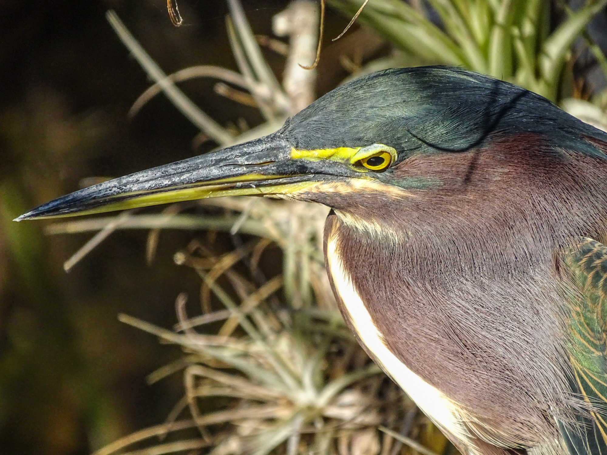
Green Heron at screen resolution. Sony HX400V


Detail at approximately 1 to 1.


Detail at approximately 4 to 1.

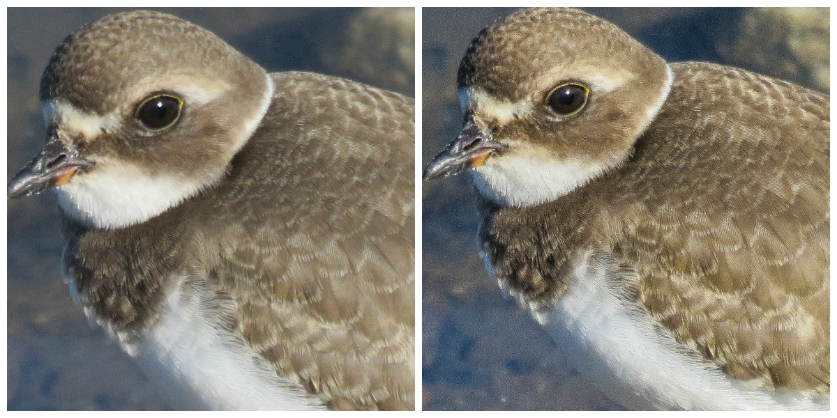
In the images above we have an example of pixel peeping. The top image is presented at screen resolution. By clicking on it you can view it at its full uploaded resolution of 2000×1500 pixels. You will see at anything up to that size (and considerably larger actually) the image looks great…excellent rendition of detail and color…certainly very satisfying. Until recently an HD computer monitor or LCD screen was 1900 pixels across, so this image would fill the screen. It would make a 10×8 inch print at 200 dpi…excellent quality.

The next image shows a small segment of the first blown up so that you can see each pixel. That would be the equivalent of full screen view on a monitor with a resolution of 5184×3888 (twice the resolution of highest resolution LCDs currently in production), or a print 25 inches wide. At that size the artifacts are just beginning to show. Still, from anything more than a foot away, the image on an HD screen or the 25 inch print would look amazingly detailed, smooth, and satisfying.

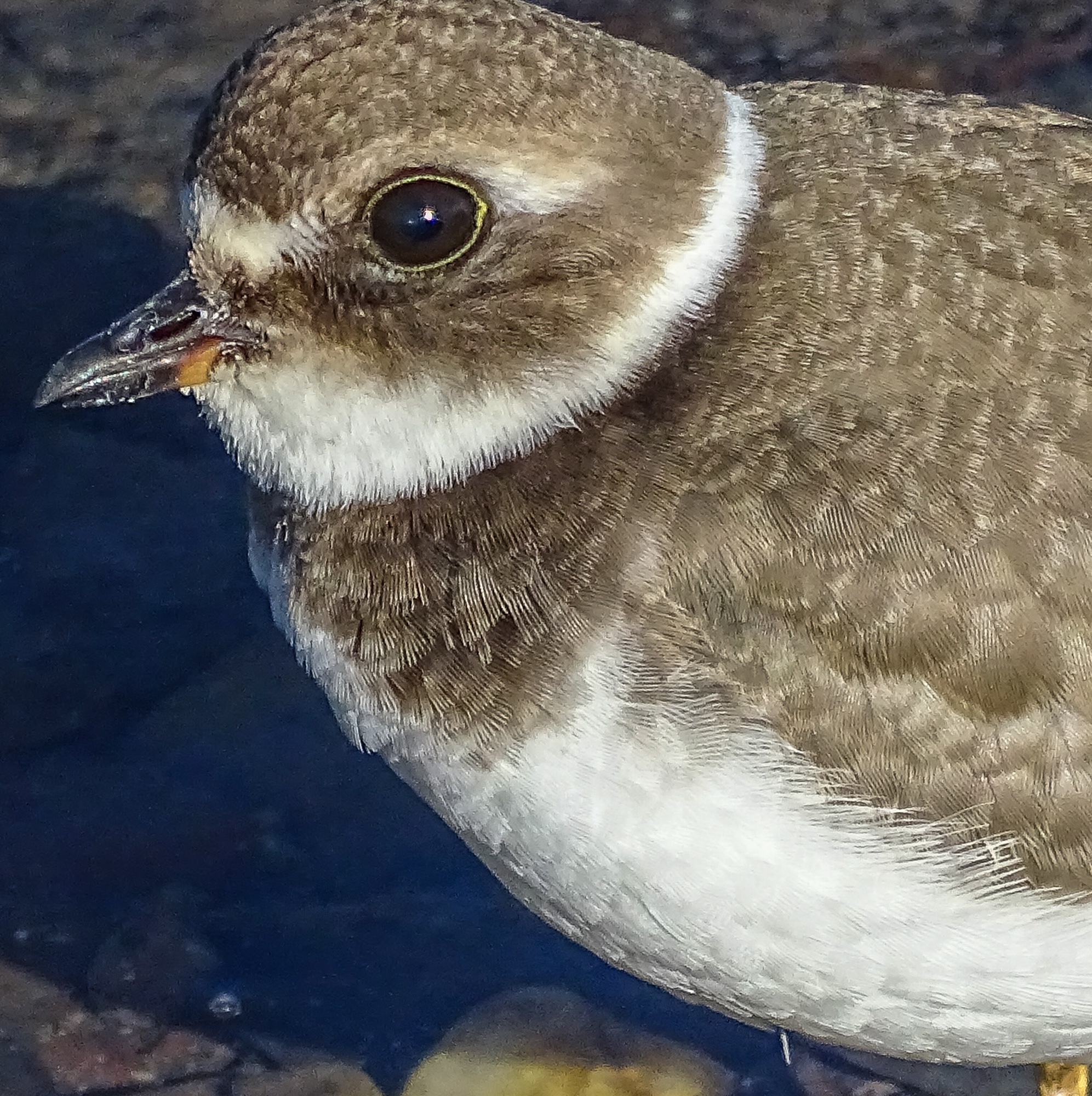
The final image is an even smaller segment of the first, now blown up to 4 to 1…four times full resolution. At this scale the artifacts are obvious…but it is the equivalent of a print 100 inches wide! Even at that scale, from more than 4 or 5 feet viewing distance, the image would still look almost as good as it does on at screen resolution. Don’t believe me. Next time you are in an airport, take a really close look at one of those wall sized images. 🙂

So, bottom line. The artifacts you see in Point and Shoot images when you pixel peep are necessary to the pleasing effect of the images viewed at normal viewing sizes. If you have opted for the convenience, the flexibility, the compactness of a Point and Shoot superzoom…just enjoy the results it is designed to produce. Do not pixel peep. The artifacts you do not see can not hurt you…and you will get full enjoyment out of the images you bring back…images that you would be unlikely to get with any other camera!

Backgrounding. P&S Technique

I will admit to not being nearly as sensitive to background in my wildlife and nature shots as I should be. On the other hand, there are always two ways to become known for your photography. 1) you can work very carefully, and develop great skill in waiting for exactly the right light and working the angles for the perfect background on every shot you take…or 2) you can shoot a lot…all the time…every time you get any kind of chance at all…and then be very selective in what you show to other people 🙂 Either method works…and most honest photographers will tell you that their success rests on a combination of the two. It is important to be able to take an exceptional photograph when the opportunity comes your way…and to be able, within the limits of what nature offers, to create that opportunity when ever you can…but it is just as important to shoot all the time, to shoot a lot, a lot…and to learn to recognize the exceptional shot when you come to process it.

Either way, background has to figure into your calculations. By background I mean whatever is behind your subject…or whatever fills the space in the frame not occupied by the focus of your attention. It if it a picture of a bird, it is everything that is not the bird. If it is a picture of person or an elk, it is everything that is not person or elk. Etc.

Take the two images that lead the post here. It is the same Green Heron, taken from the same boardwalk…Anhinga Trail at the Royal Palm Visitor Center at Everglades National Park…moments apart. The difference is that I re-positioned myself and my camera a few feet down the boardwalk for the second shot in order to get a less cluttered background. I wish I could say it was a conscious choice…but honestly, I was just experimenting with different angles, and noticed the different effect of the background only while processing the images.

And the difference here is not as dramatic as it might have been. There are things I like about both images.

But take this comparison.

Here I am much less ambivalent about which is the better photo. I far prefer the contrasting, uncluttered background of the second shot. The second shot also displays an effect referred to, in photographic circles, as bokeh. Bokeh is the Japanese term that is used to describe the visual structure of the out of focus portions of an image. We say an image has nice bokeh when the out of focus background is pleasing to the eye. Pleasing to the eye, of course, is a judgement call, but there seems to be quite a bit of consistency in the way the term bokeh is used…which leads me to believe that we humans tend to agree, for the most part, on what kind of background is pleasing. An out of focus background that shows some abstract pattern, but not so much as to be distracting, seems to get the most consistent praise.

These are two very similar images taken of the same species of bird miles apart. One is from the Anhinga Trail at Royal Palms, the other is from Shark Valley, both in Everglades National Park. The difference between them is subtle…but it definitely hands on the background.

One more really obvious example, though in this case I could have done nothing about the background in either image. I was shooting from the car for the first image, across the passenger, and the bird was on the ground, so my options were limited. The second bird was simply perfectly posed on a post beside West Road in Shark Valley and sat there while I stopped my bike and got off a short burst of images, before flying away. There was no chance to reframe in either case.

Obviously, if you have a choice, maneuvering for a less cluttered background should be part of your photographic habit. A few steps right or left, or a shift in angle up or down…or both…is often all it takes. This is the same spider at Shark Valley, from just a slightly different angle.

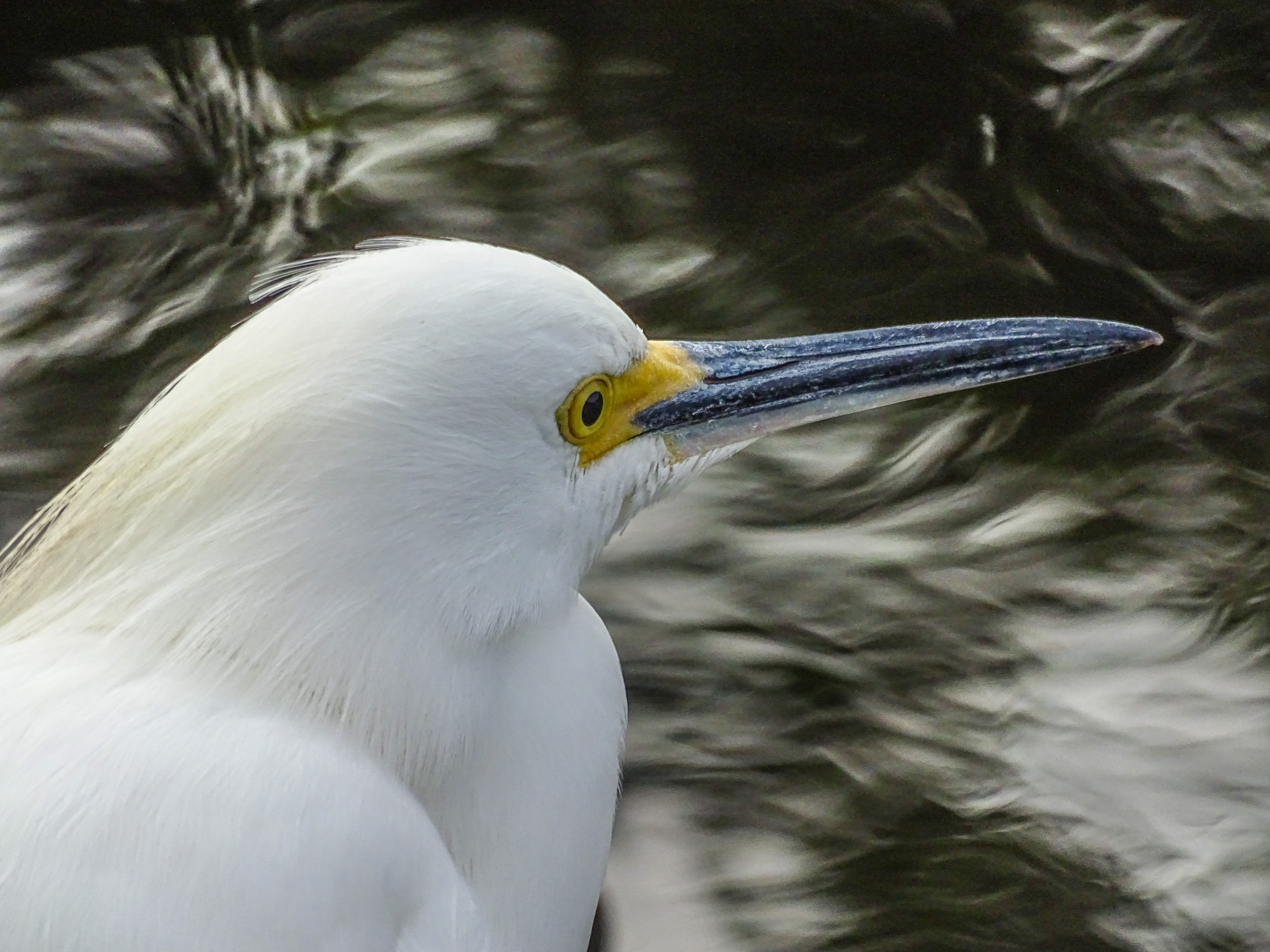
Snowy Egret, Shark Valley, Everglades NP


Sometimes it is totally the background that makes the shot, as in this image of a Snowy Egret at Shark Valley. Until I pressed the shutter and reviewed the image, I could not see the pattern that the light on the moving water made in the background, and it did not really come up until processing in Lightroom. But I have to tell you I was really happy to see it there!

The background effect is just one more thing to think about while shooting and while processing…but giving it the attention it deserves will improve your images and repay the effort. Eventually someone is going to say “nice bokeh” when you show them a shot (if you have any photo-geeks among your friends at all), and you will be able to say, “Yes…I worked hard to get that!” or, at the very least, “Thank you!”

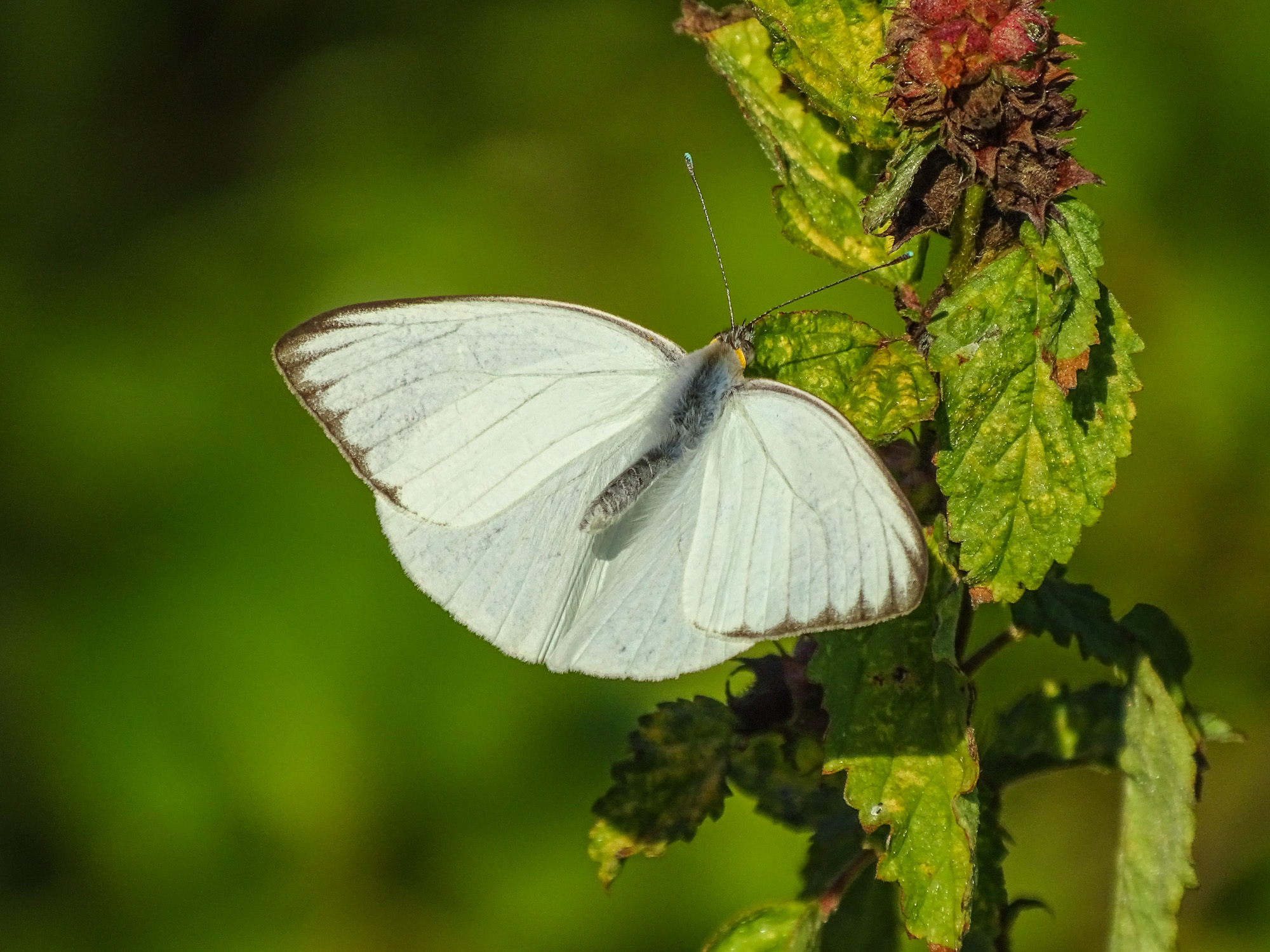
Florida White, Eco Pond, Everglades NP.


BIF with a Point & Shoot!

Three Sanhill Cranes in flight. Bosque del Apache NWR

Birds in flight are such a challenging photographic subject that the category of images has its own internet acronym: BIF. Go to any of the camera forums (like those on dpreview.com) and you will see periodic discussion of the challenges and techniques of BIF photography. Mostly the challenges.

Standard BIF rig. Photo from Borrowlenses.com

Until very recently BIF was the sole domain of the long lens, DSLR photographer, generally shooting off a heavy duty tripod with a gimbal head (one of those heads that suspends the lens from above and allows free motion up and down and side to side for panning and following BIFs). Only a pro level DSLR had the focus speed to catch BIFs and most BIF photographers shot with 400-600mm lenses to fill the frame.

And they practiced, almost to the point of specialization, to develop the panning and following skills needed. I see photos of BIFs that just leave me speechless…they are that good, and that amazing.

Of course, that has never stopped me from attempting BIFs with my chosen Point and Shoot super-zoom cameras. Until a generation ago (camera generation…about 2 years) the results were spotty at best. I got an occasional keeper on a day and in a place where there were lots of birds in the air and I had lots of time to practice. Rookeries. National Wildlife Refuges that draw geese, ducks, and cranes. Etc. But it was more by chance and persistence than it was by skill when I came home with anything I wanted to share.

Canon SX50HS in Sports Mode

However, with the advent of the Canon SX50HS and its effective Sports Mode, suddenly BIFs with a Point & Shoot became a lot more possible and a lot more fun. Sports Mode on the SX50HS was programmed to lock focus on a moving subject and then to follow focus on that subject while it was still near the center of the frame. Combined with a 3.4 frames per second continuous shooting mode, Sports Mode made it really possible for the first time to get consistent BIF shots without investing in the full DSLR rig above.

In a place like Bosque del Apache National Wildlife Refuge or along the cliffs of Point Cabrillo in San Diego, where there are Snow Geese and Cranes or Pelicans in the air almost continuously, with practice you could pick up a bird and center it far enough out so you could pan smoothly and follow…half press the shutter release to lock focus…and then fire off a burst when the bird was near filling the frame…continuing to pan with the bird for best effect. You were half-blind once your pressed the shutter, since the viewfinder did not refresh fast enough to really follow the bird…but it could, with practice, be done. 🙂

Pelican off the Tide Pools at Point Cabrillo in San Diego. SX50HS in Sports Mode.

There was a good deal of debate on the forums (not helped by inconsistencies in the Canon documentation) about whether Sports Mode did in fact follow focus once you pressed the shutter release to start your burst. I was, and remain, in the “yes it does” camp, and have results to prove it, at least to me. The doubters have their demonstration sequences as well.

However it works, the Sports mode on the SX50HS (and I assume on the SX60HS as well), makes BIF fairly easy, given the right birds and a bit of patience and persistence.

I have been waiting for my yearly visit to Bosque del Apache NWR to really give the Sony HX400V Sports Mode a fair trial.

The Sony works very much like the Canon. There is a large rectangular focus frame in the center of the view. The Sony auto-focuses on whatever is nearest the center of that frame using continuous auto focus. When you half press the shutter release it locks on the subject, and then follows focus on that subject as it moves within the frame or as you pan with the motion.

The HX400V has two continuous shooting modes, and you can use either in Sports Mode. I have been using high speed burst which is 10 frames per second for 10 frames. It is possible to shoot a shorter burst than 10 frames, but you have to be really light on the shutter release. The finder flashes while shooting the 10 frames, but you get a pretty much continuous look at your subject to aid in panning.

Tandem Snow Geese. Sony HX400V in Sports Mode

In practice, I generally had to zoom the Canon SX50HS out to 600mm equivalent field of view to get consistent BIFs. On the Sony HX400V I can use the full 1200mm reach. It is that much easier to use. 🙂 (But then it is really two generations newer than the SX50HS.)

Three at a time. Sony HX400V

These shots are not perfect. If you blow them up to full resolution on the computer (pixel peeping) you see some artifacts, but at reasonable viewing and printing sizes they are simply very satisfying. And so easy!

Sports Mode on the Sony HX400V completely takes over control of the camera, so if you are not the trusting type, in might not suit you. The only thing you can change is the speed of continuous shooting. However, even in difficult light, Sports Mode on the Sony does the job.

Sandhill Cranes and Snow Geese against the sunset.
Landing in the dawn light
Cranes on a burning sky.

Of course, the better the light, the better the results.

Snow Geese against the Mountains to the West of the refuge.
Solo Snow Goose
Cranes at 1200mm equivalent field of view.

Remember: patience and persistence. Take a lot of images. Try, try, and try again. And don’t grieve the close shots…the near misses…the not quite, but close stuff you have to delete from the card. Just keep shooting. Eventually you will get the shots you want.

And don’t try BIFs, at least at first, unless you have a lot of birds to practice on…even if it is only gulls at the local landfill. Even with the aid of the excellent Sports Modes on today’s Point and Shoot super-zooms, it takes practice!

My last image here was submitted to the Canon Print Challenge on Saturday at Bosque del Apache, along with many images from conventional long-lens, DSLR, tripod wielding photographers…and it won! At the end of the competition the Canon folks made me a 13×17 inch exhibition print on art paper…and it looks great! So don’t let anyone tell you you can’t, or should not even try to, shoot BIFs with a Point and Shoot. It can be done. Easier with each generation. 🙂

Puddle Ducks Away! Sony HX400V in Sports Mode.

.

Point and Shoot Depth of Field

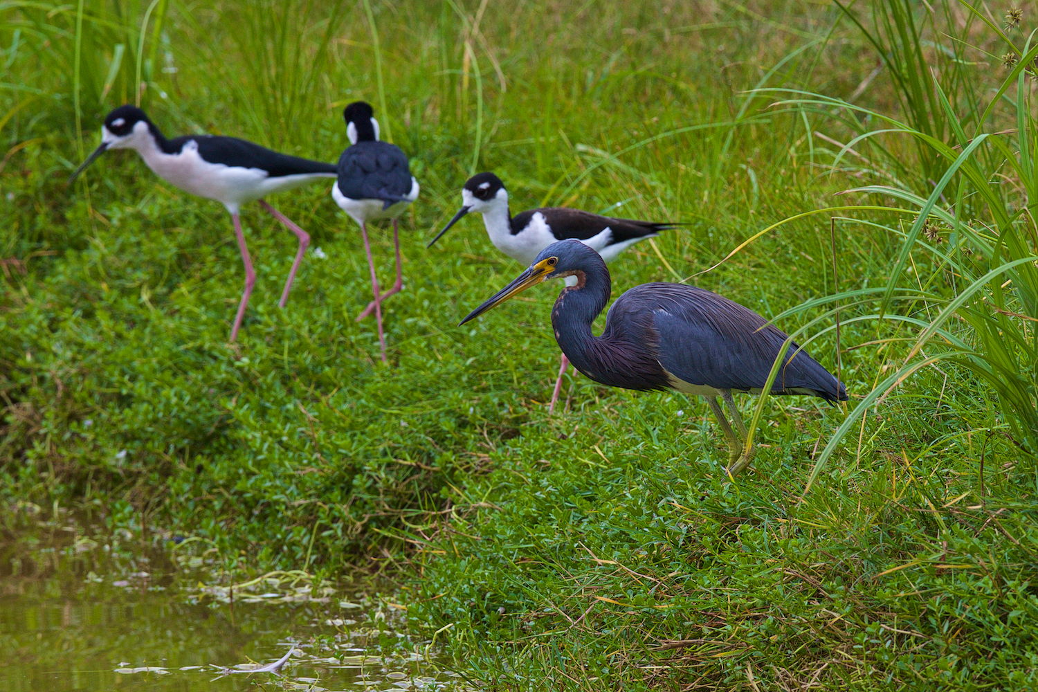
Tricolored Heron and Black-necked Stilts. Edinburg Scenic Wetlands World Birding Center, Edinburg TX

My DSLR, long lens, tripod totting, friend Paul and I spent several days photographing side by side in the Rio Grande Valley of south Texas. He shoots, much of the time, with his massive 400mm, f2.8 Canon Image Stabilized lens mounted on his 5D full frame DSLR and a heavy-duty carbon fiber tripod. It is a brilliant lens and a very capable camera, and he gets stunning results. However he found a few things to envy in my long zoom Point and Shoot rig (I was shooting with the Sony HX400V, 50x, 20mp camera.)

Of course I was shooting my first images while he was still setting up his tripod, and, of course, I had 4 times the reach he had…with 1200mm equivalent field of view. And of course, as the days wore on it became obvious which of us was carrying 8 pounds of lens…close to 12 pounds total equipment, and which could tuck his whole rig into a small bag at his waist. 🙂

But the thing Paul kept coming back to when we looked at our images later in the day was how much depth of field the small sensor camera gives you when compared to his full sized sensor…and most of the time he was comparing his depth at 400mm and mine at 1200mm. By depth of field, if you are not familiar with the term, I mean how much of the image, from foreground to background, is apparently in focus and sharp. For birds, wildlife, and macro work the depth of field can be critical, especially at the longer focal lengths needed to fill the frame. It is especially critical when shooting a group of birds (or other critters) as in the leading photo here. Paul was not able to get the Tricolored Heron in the foreground in focus at the same time as the Black-necked Stilts in the background, even if he stopped his 400mm lens down to f5.6 or so (reducing the aperture increases depth of field). As you see, even at 1200mm equivalent field of view, the Sony managed to get all the birds in relatively good focus.

For comparison here is one of Paul’s shots with his 400mm plus 1.4x extender for 560mm. He stopped down to f10 to improve depth, and was shooting at less than half the equivalent focal length of the Sony P&S, but still did not manage to get the same group of birds in focus.

Canon 5D with 400mm plus 1.4x telextender. f10

Here is another example: the Little Blue and the Snowy were separated by about 3-4 feet, yet the Sony managed to get both in focus at 1200mm equivalent and f6.3. Only a Point and Shoot superzoom is able to do that trick 🙂

Little Blue Heron and Snowy Egret

It has to do with sensor size, and the real focal length of Point and Shoot camera lenses. Since the sensor in my Sony is 5.6 times smaller than the sensor in Paul’s Canon 5D, it only takes a 215mm lens to make objects (or subjects) the same size in the image as thew would be with a 1200mm lens on his camera (215×5.6=1200). More practically for comparison, when I set my zoom to 400mm to match Paul’s 400mm Canon lens, my real focal length is only 71mm. He gets the depth of field of a 400mm lens, and, while framing the same group of birds so they look the same size in the image, I get the depth of field of a 71mm lens. That is a dramatic difference. Even at my 1200mm setting (remember 215mm real focal length), I still have twice the depth of field he does with his 400mm lens. That means that even if he crops his image to match mine, I will still have significantly more depth.

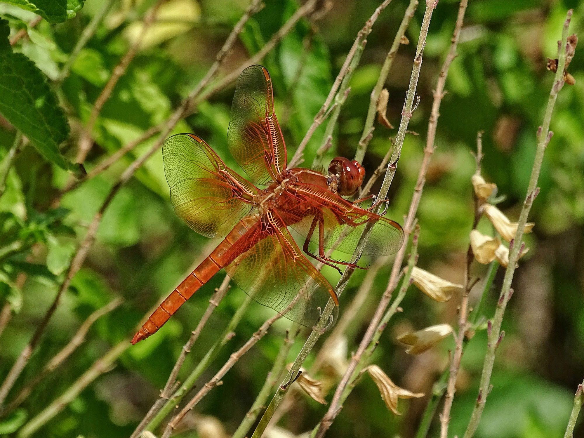
Depth of field differences also come into play when shooting close your subject. This shot of a Red Saddlebags Dragonfly from 7 feet at 2400mm equivalent field of view (1200mm optical plus 2x Clear Image zoom on the Sony), would simply not be possible in any single image from a conventional DSLR and lens, unless you shot from a few inches away with a 71mm lens (and even then you would have to crop the image by a factor of 2). And believe me, getting that close to a Red Saddlebag in the field is not easy 🙂

Red Saddlebags 2400mm equivalent from about 7 feet.

Or consider this true macro, taken from about an inch, using the Sony HX400V at about 61mm equivalent field of view. The real focal length of the lens at that zoom is 10.9mm…which on a full frame sensor would be a fish-eye wide angle. I get as much depth of field as I need in any macro setting.

Spider at about 1 inch.

The spider is relatively isolated, but in a macro like the one that follows, depth of field is critical to the effect.

Bee on the Blazing Star

Even when shooting at wild angle, for landscapes, the extra depth of field of the P&S superzoom can be used to good advantage. I enjoy a photograph with a great depth.

Low angle, wide angle, with great depth. 24mm equivalent (real focal length 4.3mm)

It is sometimes argued that the greater depth of field in small sensor Point and Shoots is a disadvantage when you do want to use selective focus…as in some wildlife, some macro, and almost all portrait photography…where you want your subject isolated against an out of focus background for the classic photographic effect.

Portrait at 400mm with a full frame DSLR. Nice separation and excellent bokeh.
Same distance, about 200mm equivalent with P&S

If I had cropped in closer by zooming out to match Paul’s 400mm, the background would have been less sharp, but not as well isolated as the full frame shot. Still, as the macros above demonstrate, subject separation can be achieved even with a P&S.

All in all, I find the extra depth of field of the P&S superzoom to be an advantage for nature photography way more often than it is a disadvantage. It makes both telephotos of wildlife and macros of bugs and flowers easier, and produces great landscape effects. In fact, I am so used to working with generous depth of field that I am pretty sure I would be quite frustrated moving to a full frame system at this point. I love shots like this one of a Common Paraque in the half-light too much. Only a P&S superzoom could produce this result…with so much of the bird in focus at this distance and scale.

Common Paraque. Estero Llano Grande SP World Birding Center, Weslaco TX

So, just one more reason to enjoy Point and Shoot Nature Photography. 🙂

Point and Shoot Nature Photography at the National Butterfly Center.

Bordered Patch, National Butterfly Center

I recently spent several hours at the National Butterfly Center south of Mission Texas (and at Bentson State Park World Birding Center next door.) The NBC is one of my favorite places to photograph…the density and variety of butterflies and dragonflies found in the gardens right on the Rio Grande river can not be matched anywhere, at least in a natural setting (as in…not in a butterfly house). You an see the results in my WideEyedInWonder gallery. National Butterfly Center.  If you pursue the exif data (available with the “i” information icon) you will see that most of these shots were taken with -.3 to -.7 EV exposure compensation. The ultra bright, high saturation, high contrast colors on butterfly wings tend to burn out…turn light or white…with normal exposures. Underexposing slightly keeps the colors as vivid as they are in life.

Julia Heliconian (Longwing)

Fear not the darkness…

Yellow=rumped Warbler, Cape May NJ, ISO 1600.

When you read the reviews of Point and Shoot cameras, especially the superzooms we favor for bird, wildlife, and nature photography, you are sure to come across comments about their less than stellar low light performance. No digital sensor camera does as well at high ISOs as it does at low ISOs. Digital sensors love light, and the more light, within reason, the better the image quality and the image detail you can expect. And the smaller the sensor, the common wisdom goes, the worse the high ISO, low light, performance you can expect. The tiny senors in the P&S Superzooms can not be expected to equal the performance of APS-C or full frame sensors.

Full sun vs full overcast: ISO 160 ves 1600
Full overcast vs full sun: ISO 1600 ves 160

On the other hand, you will notice that with each new generation of digital sensors, the maximum ISO ratings increase. Full frame cameras will let you set ISO to 5 digits these days…totally unheard of, undrempt of even, ratings back in the days of film. Remember, ISO 800 color slide film (ASA 800 in those days) was revolutionary, and only to be used in emergencies, since its performance…with highly visible grain, limited contrast range, and muted colors…left a lot to be desired. Those were the days when Kodachrome 25 was still the standard for published photos.

Even today’s P&S cameras will reach 3200-6400 ISO, though to listen to the reviewers, anything over ISO 400 on some, and certainly ISO 800 on most, is simply unusable. Same issue: visible noise (the digital equivalent of grain), limited contrast range, and desaturated colors. However, each new generation of P&S cameras also has improved noise reduction built into the jpeg processing engines. Yet the common advice is still to turn it off if you can…or to shoot in RAW (again if you can)…and do any noise reduction in software after the fact. The Image Quality issues (watercolor effects and detail smearing) that are often claimed for P&S superzooms are often attributed to “overly aggressive noise reduction.”

Still, if you shoot wildlife…especially active birds…in anything but full sunlight, you sometimes find yourself making the hard choice between higher ISOs and slower shutter speeds. Nothing will destroy image detail quicker than camera or subject motion, so you pretty much have to keep the shutter speed up, and let the ISO got where it needs to.  I do not like to shoot birds and wildlife at anything under 1/500th of a second, even with today’s excellent optical image stabilization. Even if the camera does not move, the critter is likely too. 🙁

On my latest photo trip to Cape May, New Jersey, for the Autumn Bird Festival, the days ranged from rain and overcast to full sun. If I wanted to shoot birds it was necessary to let the camera do its ISO thing, using the full range available to me. The first two days I still had not figured out how to set the camera so that it was not limited to ISO 1600 in Auto ISO, so that limited me even more. I did eventually figure out how to let the IsO ride all the way up to 3200.

Reflecting on the results, and my efforts around home over the past weeks and since returning from Cape May, I have come to a pretty startling conclusion. At least with the superzoom I am using (Sony HX400V), the high ISO results were not all that bad…in fact…they were very good…especially when you consider that I could not have gotten the images any other way. When choosing between some kind of pretty good okay image and no image at all…well, that is an easy choice for me. 🙂

The first thing I learned is that there is a lot of detail in underexposed images. While the camera was limiting me to ISO 1600, many of my bird and wildlife shots were seriously underexposed…by several stops. Yet, when taken into Lighroom, I was able to bring them up to quite acceptable levels and produce images that were satisfying, if not spectacular…and you might even consider them spectacular if you take into account the conditions they were taken under.

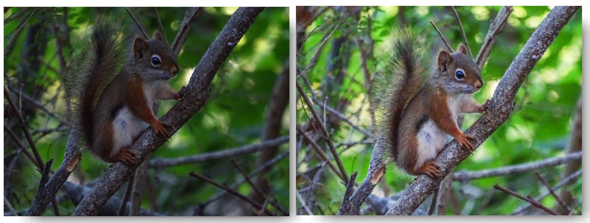
Consider this Red Squirrel from Laudholm Farm…taken before I left for Cape May. It was so dark in the under the apple trees and in the brush that I pushed the shutter speed all the way down to 1/160th at ISO 1600, stretching both the Image Stabilization of the camera, and the good will of the squirrel to the max…and the image was still several stops underexposed.

underexposed at 1/160th @ ISO 1600, processed in Lightroom

As you see, while not a great image, it is hard to tell the processed result was ever that underexposed. Color is pretty good. Detail is satisfying. Both noise and digital artifacts are visible in the finished result, but only if you view the image at full resolution. At normal screen sizes it looks pretty good okay! And…of course…I could not have done any better with any camera I could have been carrying…a full frame DSLR would have wanted even more light…pushing the ISO higher and the shutter speed lower…and no lens I could have hand-held…no…no lens I could have used even on a tripod…would have equaled the 1200mm reach of the Sony HX400V. I would have had to crop heavily to achieve this image scale. Given that, I am convinced that this image is better than I would have gotten with any other camera. You want more proof…

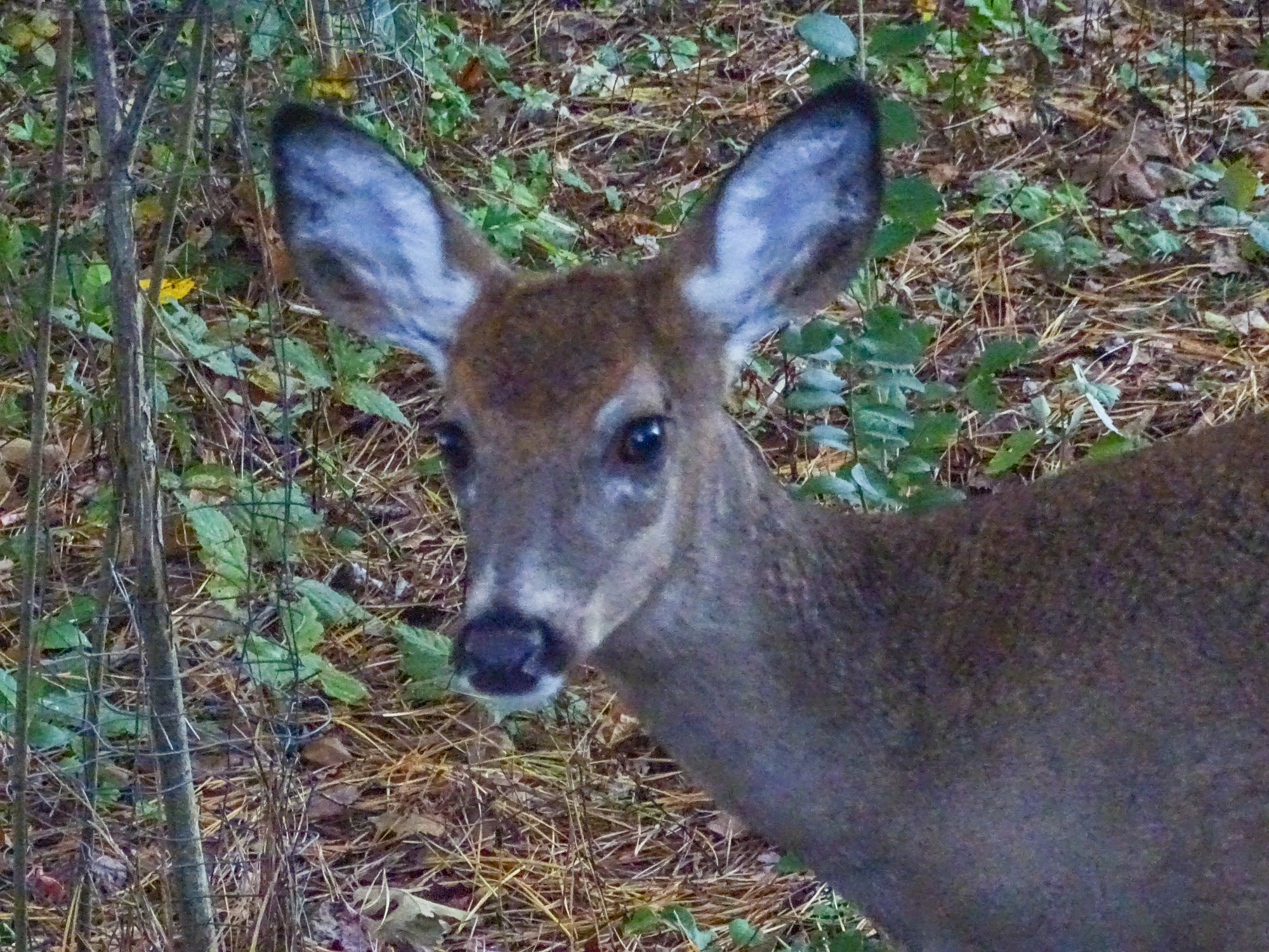
Deer at 1600 ISO. Well underexposed and brought up in Lightroom.


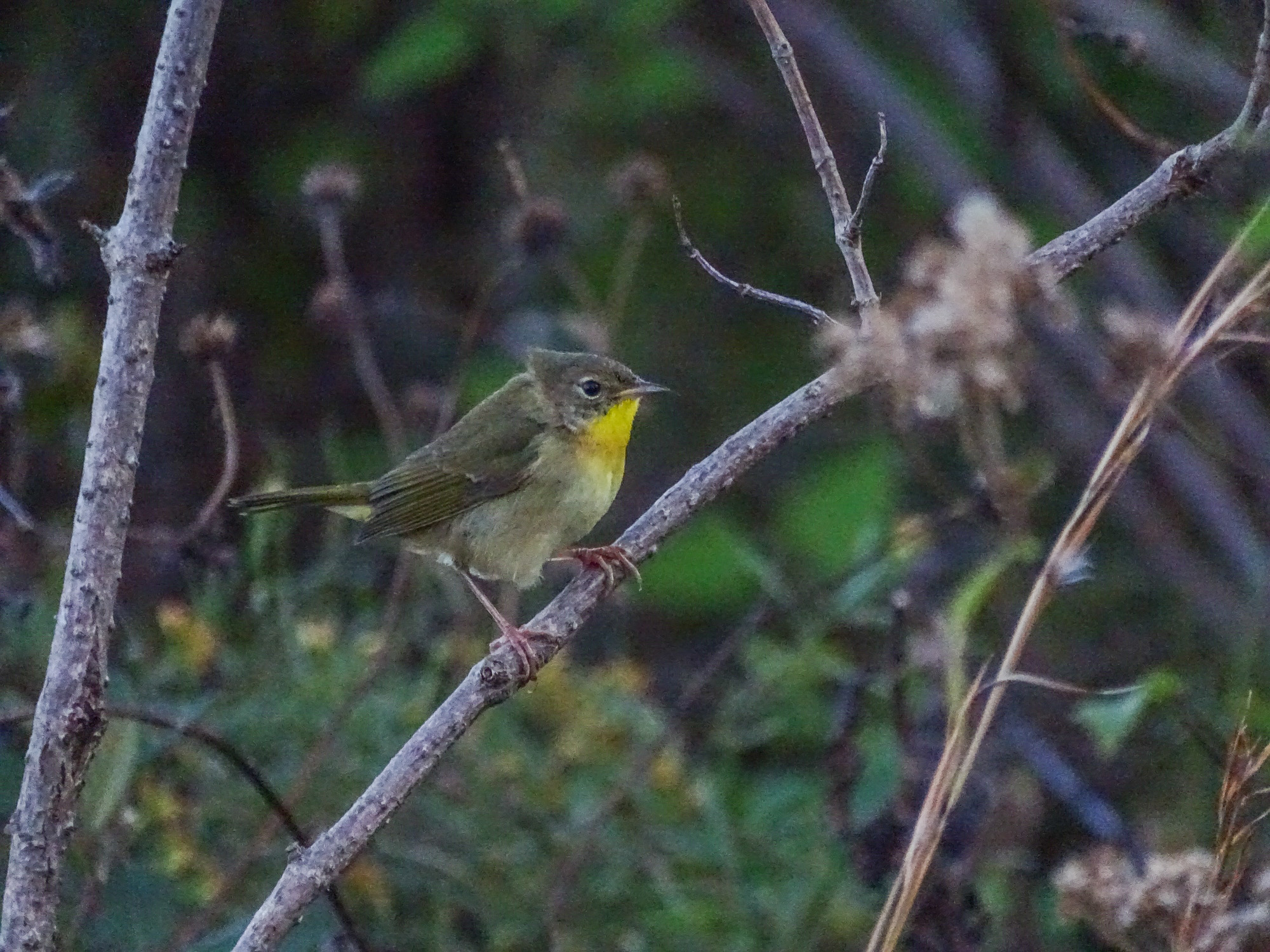
Common Yellow-throat, again underexposed at ISO 1600.

Again, not great shots, but satisfying, considering any reasonable alternative. 🙂

When I did figure out how to set Auto ISO for the full 3200 range on the HX400V, I was even more surprised by the results! The images, of course, required much less lightening in post-process, and maintained good color saturation, satisfying detail, and very few visible artifacts in the backgrounds (a problem area for any high ISO shot). And this is straight from the camera, with only my standard one click preset Lightroom processing. I did not, at first, even apply any extra noise reduction in Lightroom…though I did find that some slight Luminance NR, with detail emphasis, did produce an even more satisfying result.

It is even possible to crop an ISO 3200 image from the Sony HX400V and get acceptable results…pretty good okay results! This chipper is proof enough for me. In-camera Noise Reduction set to standard. Sharpening to -1. Saturation to +1. My standard one click processing in Lightroom with some added NR.

ISO 3200.
ISO 3200. Cropped.
ISO 3200. Cropped.
ISO 3200. Cropped.

So folks, here is my conclusion. Unless you are looking for magazine quality publication images…if, in other words, your main interest is sharing on the web and the occasional print for the wall or for a gift…you have no reason, with the latest crop of P&S superzooms, to fear the dark. Go boldly. Set your ISO high and bring back satisfying images of the birds and wildlife you encounter in less than ideal light…images you would be very unlikely to get with any other camera.

Do not fear the dark…

P&S Nature Photographer does Cape May Autumn Weekend

Golden-crowned Kinglet. Cape May NJ. Sony HX400V

I had a wonderful few days in Cape May NJ, covering the Cape May Autumn Bird Festival for ZEISS Sports Optics, and teaching my P&S for Wildlife workshop. Lots of photo ops. Lots of great birds, relatively close. The light was not always the best, and it often stretched the limits of the Sony HX400V camera, but I am more than pleased with the results. I also, of course, did some macro work, and a bunch of in-camera HDR. I also practiced using Sports Mode for flight shots.

You can explore the results to your heart’s content by visiting my gallery at Wide Eyed In Wonder.  Cape May 2014. 

Enjoy!


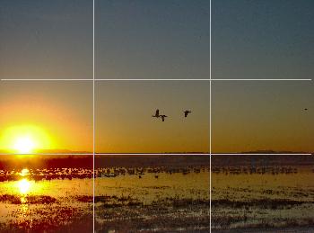
The really strong suggestion of thirds…

This image is all about the suggestion of 3rds!

I was thinking about this while out catching images this afternoon. I have a little grid in my camera viewfinder that separates the view into thirds both ways: two horizontal lines and two vertical lines which intesect each other at the 1/3 points, and kind of float there in the view.

The rule of 3rds grid in my viewfinder.

I use them all the time. I use them to decide where to place the horizon (and to keep the horizon straight). I use them to decide where to put the strong verticals in the image. I use them to decide where to put the primary subject…where to put what I want to viewer to notice first and to keep coming back to in the image. I never turn the grid off, though I could. It is there all the time, dividing the view into thirds.

You are going to hear about the rule of thirds sooner or later, so, if you haven’t heard about it already, you might as well hear it from me. (And I will try to make this article worth your while even if you have heard all you think you want to know about the rule of thirds.)

First, let’s get the rule part out of the way. Photography is an art, right, and some people strongly object to the notion that there are, or even can be, any kind of rules that govern an art. Art is about creativity, and creativity, in the minds of some, is most often about breaking the rules.

Horizon and strong vertical element: 3rds!

In the minds of some. Others see creativity as an act that is self-defining…it may obey all the rules you can imagine for its form, but it manages to be something more than the rules could have predicted. In a real sense, truly creative acts define the rules without being defined by them…they give, by their creative example, whatever rules might exist their true meaning and only reality.

But, just to be on the safe side, let’s say there is no rule of thirds. There still might, however, be a really strong suggestion of thirds.

That little grid in my viewfinder divides the view by the rule of thirds…er…the suggestion of thirds.

What that gives me is 9 quadrants of interest, 4 power points, two horizons, and two strong verticals. Some one must have described all this before, and you can probably find similar stuff in a hundred books on composition, but what I am telling you now I am making up as I go along. All that about quadrants of interest, power points, etc. is just the way I think about the suggestion of thirds, and it provides a frame of reference that, I hope, might help you to think about composition in your images.


compgrid[1]

The theory behind the suggestion of thirds, as I understand it, is that the eye is naturally drawn to the horizontals and verticals that divide the frame into thirds, and that our minds (spirits?) are comfortable with images that fall into 1/3 and 2/3 spaces. It has to do, some say, with a kind of tension that is introduced by that division, and the fact that the eye can roam over the frame and come back to rest at those dividing lines in a way that satisfies some inner sense of harmony.

That is why you see so many landscapes with the horizon at either the bottom or the top horizontal third line. That is why you see the strongest verticals in the images…whether they are trees, people, flag-poles, cliffs, or building edges…hugging the two vertical third lines.


At the same time, our eyes are drawn first to objects that sit at the power points…the places where the horizontal and vertical lines cross. And our eyes return repeatedly to any object (or subject) that is placed there.

Placing an object or subject at a power point produces a very different effect than placing the same object at the center of the frame. Center placement says “this is an image about this object or subject”…or perhaps even “this is a portrait of this object or subject.” That’s fine.

Placing an object or subject at a power point says “this is an image about the relationship of this object or subject to the rest of the image (and, by extension, the world as a whole). It is not a straight up portrait, but a portrayal of the object or subject in context, in relationship, in tension with its surroundings.

A seemingly insignificant or relatively small object or subject at a power point can dominate the image, drawing the eye back and back, until the mind has to grapple with the “what’s this all about?” question.

Another way of thinking of it is this: placing an object or subject at the power point is like flagging it…it says “look at this”…”notice this”…”whatever else you see here, don’t miss this.”

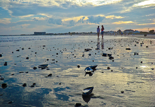
This image is not about the shells in the foreground, though they add visual interest and depth...it is about the two tiny girls standing at the power point and their relationship to the rest of the scene.
This image is not about the shells in the foreground, though they add visual interest and depth…it is about the two tiny girls standing at the power point and their relationship to the rest of the scene.

Each of the nine quadrants of interest, to me, has a different feel to it. Placing an important image element in any of the four outer corner quadrants (1,3,7,9) produces a real tension…gives the image a tilt to that quadrant. It can work for images where you want to challenge the viewer’s perceptions of the relationship of that element to the rest of the image and to the world around it.

Placing an important image element within the the outer center quadrants (4,6) feels to me like an entrance or an exit. If the object or subject is facing into the frame, then it is an entering element and there is a feeling of expectation, and eager feeling, a feeling of things about to happen.

If the object or subject is facing out of the frame, then it is an exiting element. “Just caught on the way out.” There is a feeling rush, a feeling of impatience, a tension that can be uncomfortable or simply challenging.

This entering and exiting elements concept is useful in the four corner quadrants too, of course, as elements placed there can be entering or exiting, and that will effect the way the viewer interprets the challenge of placing the object or subject there.

The center quadrant (5), as above, is, to my eye, for portraits. Everything else in the image falls away behind, is automatically rendered secondary, placed in a supporting role. The center quadrant has “star of the show” status.

And it is exactly because of that dominant feeling that placing the real “star” of the image at a power point is often more effective. No easy assumptions about the relationship of the subject or object to the rest of the frame are possible…you have to figure it out in the moment…and that creates a visual interest that we find appealing.


Star of the show…vs…an element in tension

Placing matched, or symmetrical image elements in the outer quadrants, one on each side of center, is the classic framing technique. It can give a feeling of intimacy to what might otherwise impress as a distant landscape, or it can focus the eye powerfully on the subject of the portrait.


Classic framing technique

Of course, I don’t think about all of this while I am catching images…or I wouldn’t if I didn’t have my little grid on. Seeing that grid there reminds me that I have options…I have decisions to make…and that my decisions will effect how the viewer sees the image I catch. I can, most of the time, move around and reframe to place different image elements in different quadrants of interest. I can easily make sure there is something of interest occupying at least one of the power points…and that it is the right object or subject…the one I want there. I can easily check to see where my horizon is (and if it is straight). I may not put it right on either horizontal line, but when I don’t, that is a decision I am making about the impact of the image. If there is a tree in the foreground of the view, I can decide whether I want it at the strong vertical line so people notice it (and generally accept it) or if it is entering or exiting from an outer quadrant, or if I need to balance it with something in on the other side of the image to create a frame. That decision will, again, effect how viewers see the image I catch, the impact it has on them.

There are those, of course, who see all these decisions as too studied an approach. They suggest forgetting about formal composition and just shooting from the gut. My little suggestion of thirds grid in the viewfinder would drive them crazy and they would immediately shut it off…and they would see my having it on as somehow diminishing the immediacy and power of my gut reactions to the scene before me. To them that would be a bad thing.

Of course, I beg to differ. I see the suggestion of thirds and the composition grid as a way of more effectively capturing the gut feeling that drew me to the scene…to the photo op…in the first place. Not only that, but the suggestion of thirds continuously challenges me to attempt new visions of the scene…to catch different versions of the same scene…to try out the effects of altering the composition to see which works best. To me this is a good thing.

As an exercise, go through a photo magazine or a book of prints of the great masters (photographers or painters) and see how their images define the suggestion of thirds.

Now, you might not have a built in suggestion of thirds grid in your camera…most don’t…but that does not mean that you can’t project such a mental grid on your viewfinder while you are catching images. It is a bit more effort, and you have to remember to do it (rather than being reminded by the installed grid), but it can be done.

(Of course, to a certain extent, you can exercise the suggestion of thirds after the fact, while post-processing, through creative cropping too.)

Play with the concepts of the suggestion of thirds as I have outlined them here. I’d love to hear what you think. I’d love to see examples of the work you produce.

It’s not a rule, but that doesn’t mean it isn’t still a really good idea.

wpid225-DSC05820.jpg


DIY: Bird and Wildlife Mode

When shots like this present themselves, you need to be ready, and so does your camera. Wouldn’t it be nice if there was a Bird and Wildlife Mode that would take care of all the settings for you…leaving you free to frame the shot and shoot?

The Nikon P600 actually has a Birding Mode as one of its scene settings, and other cameras may have a Pet mode that is similar, but reviewers have pointed out that these generally are not actually the ideal combination of settings for birds and wildlife. On all other Point & Shoot superzooms, you can fairly easily create a Bird and Wildlife Mode and save it to one of you Custom or Memory settings. This is not for the faint hearted. It will require some digging around in menus and even your manual if you are going to succeed…but the rewards are worth the effort.

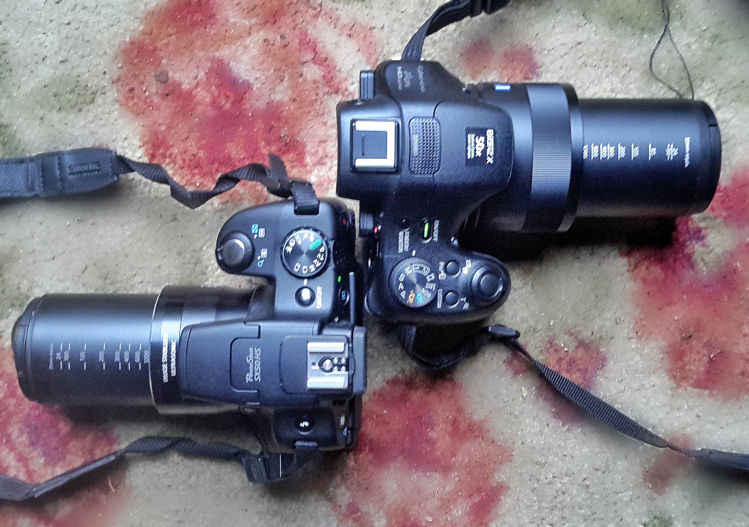
Canon SX50HS and Sony HX400V in Bird and Wildlife Mode

This I show I set up my cameras for birds and wildlife.

The base mode for birds and wildlife, since you will be using the top half of the zoom, and the full zoom most of the time, will be Shutter Preferred (labeled “T” on many control dials, “S” on others). Begin by setting your camera to T or S.

Either using the control wheel or the left/right rocker switches on the 5 way control on the back of the camera (rarely the up/down rocker switches) set your shutter speed to the lowest speed experience has shown your image stabilization will handle at full zoom. More telephoto shots are lost due to subject and camera motion blur than to any other cause. Even with the best IS, a high shutter speed will increase your chances of success. I use 1/640th and that is more risky than some would prefer. 1/1000th is probably safe. That means that when you switch to your saved Bird and Wildlife Mode, the shutter speed will be automatically set to no lower than your number…1/640th in my case. Once in Bird and Wildlife Mode in the field, if the light is good, and ISO at a reasonable value, you can easily bump the shutter speed up using the same control you used to set it.

Leave ISO on Auto (or set it to Auto if it is not there). You will need free ranging ISO to compensate for the higher shutter speeds, especially because the the typical superzoom only goes to f6.3-6.5 at the long end. You are going to be shooting wide open, at the lowest possible f-number, 99% of the time.

Set shooting to continuous. I prefer normal continuous to any high speed burst mode that might be available. I find that high speed burst too often gives me 10 identical images. 2-5 frames per second is fast enough, in my opinion, for most bird and wildlife action. If you have a choice, choose the continuous mode that uses auto-focus between frames. Both birds and wildlife are active, and you need all the help you can get keeping them in focus.

If you have control of the size of the focus square (check your menus and manual), set it to spot focus and the smallest area possible. Matrix or wide area focus, where the camera picks the focus point, will not work well, especially shooting birds or wildlife in deep cover. Also set Auto Focus to continuous to eliminate any lag while the camera finds focus.

Likewise, if you have control over the size and positioning of the exposure metering, set it to spot and the center of the field. You are more interested in getting the bird or animal correctly exposed than you are in the foreground or background.

Set image stabilization to full time, and the most intelligent mode your camera provides. This might be called active IS, or adaptive IS, or just super IS. Again, check the menus and manual.

A very difficult shot without manual over-ride.

If your camera has a manual focus over-ride on Auto Focus, and if it is easy to use, set it to active. Many superzooms provide the feature, but then make it so hard to use, involving rockers on the back of the camera, etc. that it is really useless. One of the best things about the Sony HX400V is the focus collar around the lens that can be used to fine-tune auto focus…or, more often, to quickly get the focus system in the right range so auto focus can lock without a lot of seeking.

If there is some kind of intelligent digital telephoto extender built in to your camera…most have some kind or other…make sure it is set so you have quick access to it. I am not talking about digital zoom. Most superzooms today have a mode that applies extra processing up to 2X beyond the optical zoom setting to produce very satisfying images at great magnifications. If yours works well, you will find yourself using it on occasion, even if you have over 1200mm optical equivalent to work with…especially on birds, butterflies, and dragonflies.

Sony HX400V at 2400mm equivalent

The final setting is zoom position. I keep mine set to full zoom.

Last, and most important, navigate to the menu area that allows you to memorize the the whole set of settings you just made. It might be called save settings, or custom mode, or something similar. Some cameras will allow you to save one set of settings, some will allow for two or more. Save your settings.

Now, rotate the control dial to P or A. Zoom all the way back in to wide angle. When you move the control dial to M1, or C2 or whatever the memory setting is called on your camera, just like magic, all of the Bird and Wildlife Mode settings will be restored…you will be in shutter preferred, continuous shooting, spot focus and metering, etc…and the zoom will automatically extend to full zoom. Within a second or less, you will be ready for birds and wildlife. 🙂

Depending on the features and capabilities of you particular P&S superzoom, you will want to fine tune my formula as you gain experience…or add features that I have not mentioned. For instance, Sony provides adjustable Creative Styles to control the way the image is processed from RAW to Jpeg in the camera. I have a custom designed Creative Style for birds and wildlife that is also programmed into my Birds and Wildlife mode. (It is Memory 1 on my dial, of course! 🙂

By the way, using a similar technique, I set my Memory 2 to the HDR settings I prefer, and I have my P set up (it automatically remembers the last set of settings you used, with the possible exception of zoom length) for normal and macro shooting. With Sports set as my Scene Mode, I than spend 90% of my time at one of 4 settings on the control dial. And that is worth the effort with menus and manuals.

Flame Skimmer: wildlife certainly includes dragonflies!


Shoot Out: Canon SX60HS vs. SX50HS and Sony HX400V

When the Canon SX50HS came out, two years ago next month, it was a significant upgrade from the SX40HS, which was already a great Point and Shoot superzoom for wildlife, macro, and landscape photography. The SX40HS had impressive image quality, a long zoom with enough reach for even small birds and bugs, great optical image stabilization, and a wonderful macro ability both at wide angle and at full telephoto.

The SX50HS added a 50x zoom reaching 1200mm equivalent (2400mm with a very usable 2x digital tel-converter), fast precise focus, faster continuous shooting, a great Sports Mode for birds in flight, and, for those who wanted it, RAW. It quickly became, if you measure such things by the number of users and the chatter on the forums, the de facto standard for P&Ss for nature photography.

However, in the two years since its introduction a whole new group of features began to appear in competing models and in P&Ss in general. Wifi connectivity, GPS tagging, sweep panorama (see the post), in-camera HDR that does not require a tripod (post)…not to mention ever increasing pixel counts. Unfortunately none of the newer models seemed able to match the image quality of the SX50HS, and, honestly, for the P&S nature photographer, it is all about image quality…or at least it is about image quality first.

When last October rolled around, a lot of P&S nature photographers were disappointed that Canon did not update the SX50HS. Rumors came and went, and the fate of the SX60HS became a hot topic on the forums. It came up every time there was any kind of opportunity for an introduction from Canon all through 2014.

A few months ago I decided not to wait any longer, and purchased the Sony HX400V. It has all the modern features, a 20mp sensor, and, to my eye, image quality as good as the SX50HS…better in some situations…different certainly, but still very satisfying.

This month, of course, Canon finally introduced the SX60HS. It is not supposed to ship until October 20th, but I was able to get one direct from Canon this past week.

In many ways, it is everything a P&S nature photographer could have hoped for in an upgrade.

  • The Eye-level Electronic View Finder has been improved dramatically! It is bright, and detailed…the best I have seen in a P&S camera. The LCD panel is also high resolution and very easy to use.
  • The zoom is slightly longer (65x or 21mm – 1365mm, and still with usable 1.6x and 2x digital tel-converters to get you out to 2730mm when needed).
  • The pixel count has been increased to 16mp, considerably less than the Sony’s 20, but considerably more than the SX50HS’ 12mp.
  • Continuous shooting mode has been revised to 6.4 frames per second with viewfinder refresh between frames (the blacked-out view during high speed shooting was a major criticism of the SX50HS), 4.5 frames per second with auto-focus between frames. Contrast this with the Sony HX400V which only manages 2 frames per second with focus (or without focus…though it does have a 10 fps fast mode, see below), buffers all the images, and takes a much longer time to process and write the images to the card.
  • Macro mode has been extended so that you can still focus to 0 inches (touching the front lens element) at wide angle, but now focus to 1.1 inches all the way out to 200mm equivalent! Wonderful!
  • There is built in, no tripod needed, HDR.
  • Wi-fi connectivity is built in and apps are available for Apple and Windows laptops, tablets, and phones.
  • They also claim faster focus, but, personally, I don’t see a lot of difference between this and the SX50HS.

All thumbnails here are linked to much larger files for close viewing. Click and the original will load. You will need to use the back button on your browser to return here. (if you close the window with the large scale image, you will have to navigate back to this page manually 🙂

Unfortunately, at least in my early sample, Canon has not managed to maintain quite the same level of image quality from this 16mp sensor as they got from the 12mp sensor in the SX50HS. In fact, in every test I have tried, straight out of the camera, the SX50HS shows more detail and slightly better color than the SX60HS, and when looking for fine detail, the SX60HS comes no where near the Sony HX400V. The Canon images from the SX series have always been very clean at the pixel level…showing very few digital artifacts (pixelization and blocking), noticeably fewer than the the Sony, but at sizes up to 2:1 magnification, both the SX50HS and the HX400V clearly show finer detail and less digital “smudging” than the SX60HS. Digital smudging used to be a huge issue in Sony P&S superzooms. The fine details in browns, tans, flesh color, and all shades of green would just turn to mush, as though someone had dragged a wet brush across a water color painting. In fact, it was often called the water color effect. The Sony HX400V shows very little smudging and the SX50HS shows practically none. The SX60HS, again, straight out of the camera, shows a lot…as much as or more than earlier Sony H series cameras. Even without the smudging, the detail is just somewhat soft overall in the SX60HS when compared to the SX50HS or HX400V.

To compound the matter the SX60HS images at full wide angle and full telephoto zoom appear the most soft…and this time I think it is a lens or focus issue. Interestingly the images at full zoom look fine in the wonderful high resolution EVF, but as soon as you press the shutter release all the way down, you can see the image go soft even in the EVF. ??? And once up on the computer at home, the softness is evident, especially when compared directly to SX50HS and HX400V images taken in the same spot of the same subjects.

It is, of course possible to process the SX60HS images after the fact to improve apparent sharpness and detail at screen resolution. One of the differences between Canon and Sony is that Sony always applies more aggressive in-camera processing to their jpegs. Some people feel this gives Sony images a painterly look, lacking subtly, but there is no doubt in my mind that the images have eye-appeal at normal viewing sizes. I have experimented with more aggressive processing for the SX60HS images in Lightroom, but honestly, there is only so much you can do without introducing so much noise that it becomes noticeable even at screen resolution. And I have also been experimenting with turning down the in-camera sharpening on the Sony.

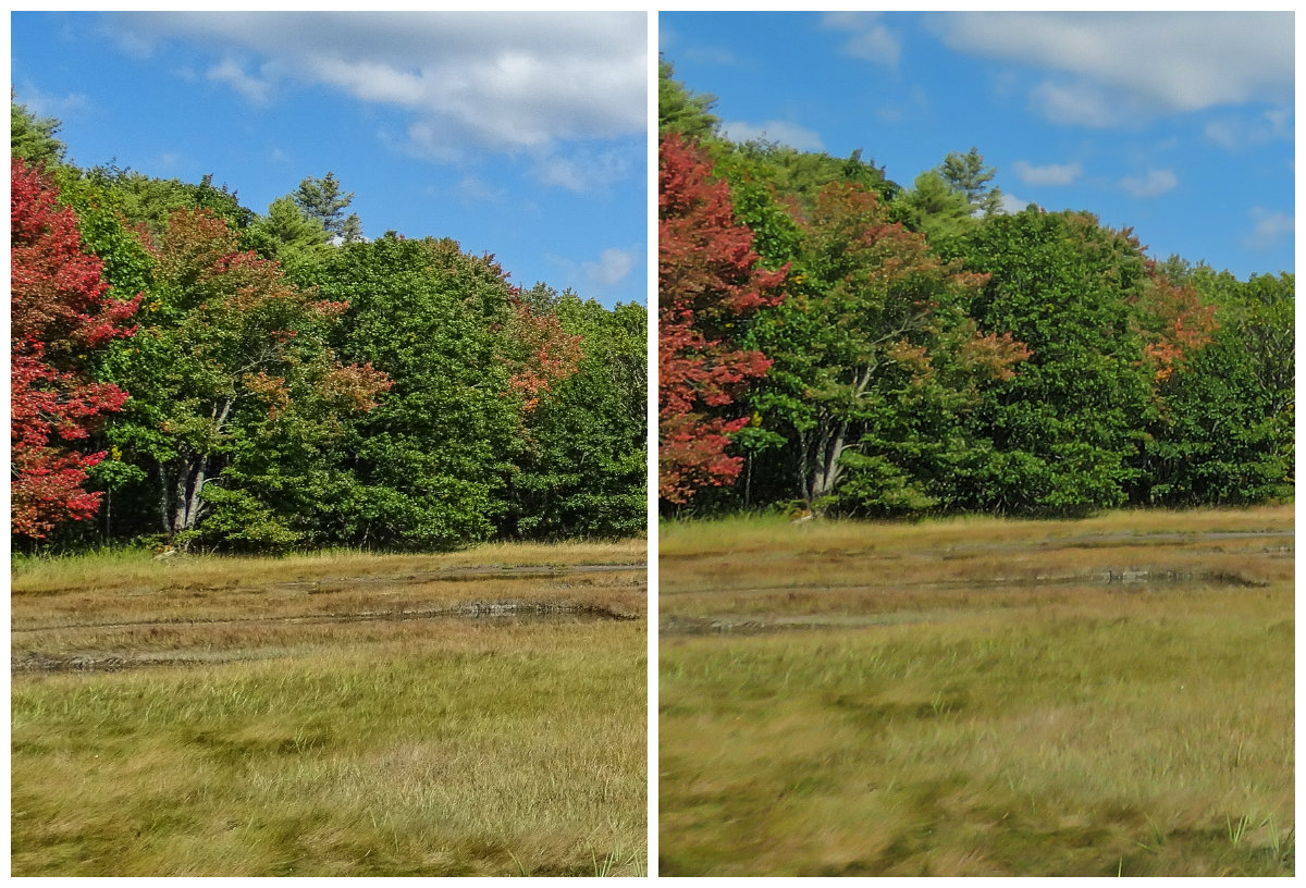
SX60HS, Unprocessed left, processed in Lightroom on right.

Even with much lighter processing in Lightroom, the Sony has better apparent detail, and this is with the in-camera sharpening turned down one notch. 🙁

HX400V. Sharpening turned down one. Processed in Lightroom.

Post-processing to the rescue is not a motto I believe in. I want a camera that has excellent, or at lease acceptable, Image Quality straight out of the camera, so that I can make it even better in post-processing. The SX50HS and the Sony HX400V give me that. The SX60HS, at least in my early sample, does not! It is not a camera I could trust in the field on a day to day basis.

HX400V left, SX60HS right. In-camera HDR processed in Lightroom.

One mode where the HX400V clearly outperforms the SX60HS is in-camera HDR (High Dynamic Range. The camera combines three exposures taken automatically at different exposures to produce a single image with better highlights and shadows than any normal exposure). The Sony allows much more control over the process, and produces consistently better results, especially when shooting without a tripod. I find the SX60HS HDR images to be mushy and messy compared to the highly detailed HX400V images. If HDR is important to you, you might not be happy with the SX60HS.

And then too, for whatever mysterious reason, the SX60HS totally lacks a Panorama mode???? What’s up with that?

tall/wide sweep panorama HX400V

And I am sorry, the Wi-fi connectivity to a computer in the SX60HS is simply too difficult to set up. It to me three days to work it out, and I am considerably computer handy. Good luck to anyone who is not. The process is unnecessarily complex, involving several trips to the Control Panel, adding devices, installing drivers, etc. Once connected the Canon Camera Window software works well. Connection to an Android tablet is somewhat easier and again, the Camera Window software works. Still, the Sony was much easier to set up.

And, for another omission that is hard to understand…the SX60HS has no GPS for tagging images.

So, you would probably not upgrade to the Canon SX60HS because of the modern features, or for image quality, as such. Though the modern features are all there (except sweep panorama and GPS), they simply are not particularly well implemented. And the SX50HS still has marginally better image quality…though the SX60HS might show slightly finer detail (as others have reported from their own samples). You still might what to upgrade to the SX60HS for the very fine EVF and LCD, longer zoom, the amazing macro mode, and the continuous shooting ability, if those are more important to you than image quality.

If you are choosing your first P&S superzoom for nature photography, the SX50HS is still available and is an excellent P&S for nature photography…especially if you do not need or want the modern features. The Nikon P600 gets very good reviews and I have seen some excellent images from it. I would love to be able to test the Fuji S1, which looks like it might be worthy camera.  If post-processing is already part of your work-flow and style, you are not adverse to a little extra work, you shoot much macro or active wildlife, and want the best EVF in a P&S, then the SX60HS has a lot to recommend it…but only if you can live with its lower image quality. The Sony HX400V, of the three cameras compared here, gives you the highest level of control over how your image is processed in the camera, delivers great images straight out of the camera, and has all the modern features (and well implemented at that). Despite its somewhat awkward continuous mode, I can highly recommend it.

As I have said, my SX60HS is an early production sample. Things may change for the better when they get production ramped up. Mine is going back to Canon, and I will be shooting with the HX400V, with some additional tweaks I have developed during this test. I may reorder the SX60HS after a few months and give it another try. If I do, and it performs better, I will certainly let you know.

What follows is a somewhat detailed comparison of the features and characteristics of the three cameras…at least the features and characteristics that I think are important for Point and Shoot nature photography. That I think! For instance, you will not find mention of RAW capability, since I don’t use it. You will not find mention of “face mode” or “creative filters”, since again, I have not found a use for them in nature photography.

Image Quality:
SX50HS: excellent, very clean overall, with good detail and color.
SX60HS: perhaps acceptable, but requires considerable post-processing. Perhaps more subtle than the Sony.
HX400V: excellent. More digital artifacts than the SX50HS or SX60HS, but very little to no detail smudging, great fine detail rendition, and vibrant colors. Not as subtle as the Canons.

At the pixel level, the SX50HS looks best…for general viewing sizes I would give a slight edge to the HX400V. Some find the SX50HS images more natural looking. I tend to  prefer the look of the more vibrant and apparently more detailed Sony images. At this point, unless Canon has a major firmware update that addresses the IQ issues, it is simply not in the IQ race at all.

Zoom range:
SX50HS: 50x, 24mm-1200mm equivalent field of view. The built in Digital Tel-converters at 1.5 and 2x provide acceptable results (especially for tel-macro where detail floods the sensor) out to 1800 and 2400mm equivalent. DTC can be applied anywhere in the zoom range, and is actually useful in macros to give large scale at reasonable working distances.
SX60HS: 65x, 21-1365mm equivalent. The Digital Tel-Converters here are 1.6x and 2x, but, since base IQ is less, they do not produce as satisfying results.
HX400V: 50x, 24mm-1200mm equivalent. Clear Image Zoom extends the range at the long end of the zoom out to 2400mm and provides very good results.

Lens speed (wide, telephoto):
SX50HS: f3.2-f6.5
SX60HS: f3.4-f6.5
HX400V: f2.8-f6.3

Though the Sony is the fastest (brightest) lens, it is not by much. None of these cameras are low-light specialists. Still they are adequate for most outdoor work, and all have special digital trickery built in to handle low light and indoor settings. And honestly, where are you going to find a faster 1200-1365mm lens for any camera? f6.3-f6.5 at those focal lengths is actually pretty fast, especially considering the light efficiency of the small P&S sensors.

Focus Speed and accuracy:
SX50HS: quite fast, and quite positive. Seeks in low light and sometimes does not find focus. Seeks in macro, and sometimes focuses on background.
SX60HS: as fast as the SX50HS, but not, perhaps, as accurate. Lots of shots are just a little off. More testing is needed.
HX400V: fast and accurate. Some seeking in low light and macro, but the hybrid focus (auto with manual assist using the excellent fly by wire collar on the lens) makes it easy to acquire correct focus in even the most difficult situations.

Both Canons also have a manual focus mode, but it is so difficult to use that it is pretty much useless.

Image Stabilization:
SX50HS: great! Allows for sharp shots, handheld, at full telephoto and even using the digital tel-converter…as well as in low light.
SX60HS: much the same.
HX400V: excellent, even better than the SX50HS, especially while framing the shot at full telephoto.

I have total confidence in the IS on the Sony HX400V. There is no situation where I feel a tripod is needed.

Macro:
Both the Canon’s have a dedicated Macro Mode. The Sony has macro focusing as part of its normal focus range. (In Auto and Program, the Canons will behave just as the Sony does and focus at macro distances without turning on Macro Mode. Macro mode is intentionally biased for close subjects…so focus may be quicker.)
SX50HS: focus to 0 in. at 24mm equivalent. Goes immediately to 1.1 in. as soon as you touch the zoom lever, and stays there until about 35mm equivalent. Goes to 1.9 in. until you reach 100mm, then jumps to 11.8 inches. You can only focus to 19.6 inches below 200mm where it jumps to 27 inches to Infinity. It quickly goes to 3.2 ft., 4.5 ft., 6.5ft. It drops back to 4.9 ft. at about 1000mm, and reaches 4.2 ft. again at 1200mm.
SX60HS: focus to 0 in. at 21mm equivalent. Jump immediately to 1.1 to 19.6 in. but stays there until you reach 200mm equivalent, where it goes to 3.9 in. At just beyond 300mm equivalent it jumps to 27 in. to infinity. From there it increases steadily to 6.2 feet just short of 1200mm and then drops back to 5.9 ft. at full zoom.
HX400V: focus to .4 in at 24mm equivalent. 1.2 in. at 50mm, 2 in. at 85mm, 6 in. at 135mm, 11.4 in. at 200mm, 27.6 in. at 400mm, 5.2 ft. at 600mm and 7.9 ft. at full zoom.

As you can clearly see, if you are into macro, the SX60HS is a great camera. Macros flood the sensor with detail, and you will get amazing results from 1.1 inches at 200mm equivalent field of view. The tel-macros on the SX50HS from 4.2 feet at 1200mm (or even 1800mm using the DTC) are totally amazing. The Sony makes up somewhat for lacking a true tel-macro with its higher pixel count and good IQ, both of which allow for pretty heavy cropping when you need it. On the other hand, the macros from 2 inches at 85mm are simply stunning!

High Speed Continuous Shooting:
SX50HS: 13 fps in dedicated High Speed mode for 10 shots. 3+ frames per second in regular continuous mode, with focus locked on the first frame, up to 24 shots. Less than 1 fps with focus between frames. Sports mode seems to break the rules and gives something over 3 fps with focus between frames, bot only in Standard resolution (not Fine).
SX60HS: as above, 6.4 fps continuous until the buffer fills, then progressively slower. Focus locked on first shot. Slower in low light. Moving the camera (as in panning to follow a moving subject) seems to fill the buffer faster. The finders is refreshed after each shot, beginning with about the 3rd shot, so you can see what you are following. 3.4 fps is set to focus between frames. There is evidently a third mode at 4.3 fps (LV: but I have not found what LV means in the manual yet).
HX400V: High speed: 10 fps for 10 frames. One press of the shutter shoots all 10 frames. Low: 2 fps. It is difficult to shoot less than 3 frames. The camera focuses between frames and the viewfinder is refreshed. However all shots are held in a buffer, then displayed to the LCD or finder as a group, then written to the card. It takes a few seconds between bursts for the buffer to clear. Sports mode on the Sony does not break any rules, and you are limited to the Low setting for continuous shooting.

In practice, I find that 13 fps, or 10, is simply too fast. You end up with 10 essentially identical images, and since focus locks on the first frame, if the first one is out of focus, they all are. 🙁 2-3 fps is fine for most bird and wildlife action, and focus between frames is essential. Of course. your needs may differ. All in all, the SX60HS is pretty clearly the winner here.

Electronic View Finder:
SX50HS: adequate (but just)
SX60HS: quite good. Higher resolution and contrast than either of the others. Colors a bit off, well on the warm side, but a real pleasure to use.
HX400V: adequate (but just). I have slightly more difficulty with this EVF in critical situations (like finding a bird in a bush or tree) than I do with the SX50HS.

For wildlife photography, a good EVF is essential. None of these match the EVF on the Olympus Mirrorless Compact DSLRs, but they get the job done. And the EVF on the SX60HS comes very close to the Mirrorless standard.

LCD:
All three are sharp and bright enough for daylight use. The SX60HS is the brightest and sharpest.
SX50 and 60HS: fully articulated, swings out and around to the side and rotates 180 degrees.
HX400V: semi-articulated. Pulls out and rotates about 90 degrees, 45 up and 45 down.

For me an articulated LCD is essential for macro and low angle landscape work. Both designs work here, but the Canon design is superior.

Controls and layout:
SX50HS: I have used this camera for two years so I am well used to where things are. There is a button for almost everything you might want quick access to, and one programmable custom button that you can reach with your left thumb. The controls are large enough for average hands. The thumb wheel surrounding the 5 way rocker control on the back of the camera can be awkward but is usable.
SX60HS: The 5 way rocker control on the back is very difficult to use without looking and the rockers are very small and too flush with the surface for my fingers. I may get used to it, but it is awkward. There is no ISO control button and the exposure compensation button has been moved off the rockers to a separate button above and to the left. The programmable shortcut button has been moved to the top where it is reached by your shutter finger. The thumb wheel has been moved from surrounding the 5 way rocker to an actual wheel immediately behind the shutter release. This means that you can NOT operate it with your finger on the shutter release as it requires that finger to turn it. Awkward! On the other hand, it is very handy for changing the primary settings in each Mode. For instance in Shutter Preferred Mode it controls shutter speed. Canon missed, in my opinion two good options for this wheel in standard Program mode. It ought to either control manual focus (ideally a manual focus assist for Auto), or Program Shift.
HX400V: Controls are well placed and large enough for most fingers. The rocker buttons on the 5 way control have a raised edge and are very easy to use. There is one programmable custom button immediately behind the shutter release and a function button to the left of it. The function button pulls up a programmable on-screen menu of the most used settings for the mode you are in. Selections are made using the center button on the 5 way rocker and adjustments are made using the excellent thumb wheel, which is ideally placed under your right thumb. (It is possible to turn this wheel unintentionally while handling the camera, but a little care solves the problem). All in all,  excellent controls and layout.

The one thing all these cameras lack is touch screen control. This is surprising in cameras at this price level. An intelligent touch screen would improve usability.

In-camera HDR:
SX50HS: three exposures, adjustable for exposure spread and center, with “creative filters” (oops, I made a lair of myself…but I don’t use them). The three exposures take significant time, so a tripod is absolutely necessary. Results are good if you set it up right. Any movement at all results in ghosting or misaligned images.
SX60HS: three exposures, not adjustable, with creative filters. Results: not so great. The range is extended, but all fine detail is lost, and detail over all is smudged. Useless.
HX400V: excellent three exposures, adjustable for spread and center. Creative filters (Picture effects) available, as well as the full range of Sony Creative Styles (Vivid, Portrait, Landscape, Sunset, etc. (By the way, each of these Creative Styles has separate settings to adjust the Contrast, Saturation, and Sharpness of the image, giving you a lot of control over how the jpeg is rendered in the camera, not only in HDR mode, but in standard Program as well 🙂 I plan to “tune” my settings on the HX400V to see if I can achieve a more subtle rendering of color tones. )

I find in-camera HDR to be a big help with dramatic landscapes…big skies, etc. Of these three, only the Sony has a really effective in-camera HDR mode, and it produces files that can be easily tweaked in Lightroom for natural look I prefer. Post.

Panorama
SX50HS: Stitch assist panorama in any direction. Display allows you to overlap three or more separate exposures or stitching later in software.
SX60HS: NONE!
HX400V: two different (wide and standard) sweep panorama modes. Images are created seamlessly as you sweep the camera across the scene in any direction, in either portrait or landscape orientation. Such fun! And don’t forget to try vertical panoramas with the camera sweeping down. Post.

Considering that Sweep Panorama is built into $200 Point & Shoots these days (phones even), it is, in my opinion, inexcusable that Canon did not implement it in the SX60HS. Sony was the first to implement sweep panorama in a P&S, and their mode is still the best!

Sports Mode:
If you shoot birds or bugs in flight, you are going to be interested in the Sports Mode on these cameras. Sports Mode is optimized for rapidly moving subjects.

SX50HS: excellent. Locks on to moving subjects and tracks them, even after the shutter is pressed. Follow focus as long as the subject is near the center of the finder. Only focuses to 49 feet at the long end of the zoom, closer in at below 600mm.  About 4 fps.
SX60HS: the same.
HX400V: large center focus rectangle picks up whatever is moving closest to center and tracks focus. 2 fps or 10 fps.

I have shot dragonflies in the air with the Sports Mode on the Sony, and many many birds in flight with the SX50HS. It is amazing that you can do either with a P&S! I plan a post of birds in flight in November when I next visit Bosque Del Apache National Wildlife Refuge and have lots of cooperative subjects. 🙂

Processing Customization:
Both the SX50HS and SX60HS shoot in both RAW and jpeg, or RAW and jpeg. That gives you a lot of control over how the image is processed after the fact. The Sony only shoots in jpeg, but gives you a lot of control over how the image is processed in camera. The Sony Creative Styles, as noted above under HDR, provide 7 different processing programs, each of which can be individually adjusted for Contrast, Saturation, and Sharpness. Your adjustment are remembered so in Program, you can have 7 individually tailored processing options. Changing Creative Style on the fly is easy, using the function button for quick access. You can also set a customized Creative Style in both of the Memory Modes. I am just beginning to play with customizing my Creative Styles, but I believe that this kind of control in-camera makes not having RAW much less of an issue.

To finish, I will give you my likes and dislikes for the Canon SX60HS and the Sony HX400V.

Canon SX60HS:

Like

  • excellent EVF
  • great macro
  • usable continuous shot
  • sports mode for birds in flight

Dislike

  • Image Quality overall
  • Poor HDR
  • No panorama
  • Difficult wifi setup

Sony HX400V

Like:

  • good to excellent image quality
  • great HDR mode
  • great sweep panorama
  • auto focus with manual assist using focusing collar on lens!
  • sports mode for birds in flight
  • easy wifi setup
  • ability to tune jpeg processing in camera

Dislike

  • awkward, annoying continuous shot mode