If you have your camera set up to produce consistent, correctly exposed, jpegs…using all the available auto, program, and special modes for a wide variety of situations, then post-processing does not need to be either a mystery or a chore. In fact, once your camera is set up, you will find that most of your photos of any particular kind (wildlife, birds, macros…landscapes or people) will require exactly the same processing…so much so that if your chosen post-processing program or app allows you to create presets or save a set of edits, you will be able to process most images by choosing the right “one-touch” preset.
If, that is, if you have your cameras set up correctly. See Basic camera settings for Wildlife, birds, and macro.
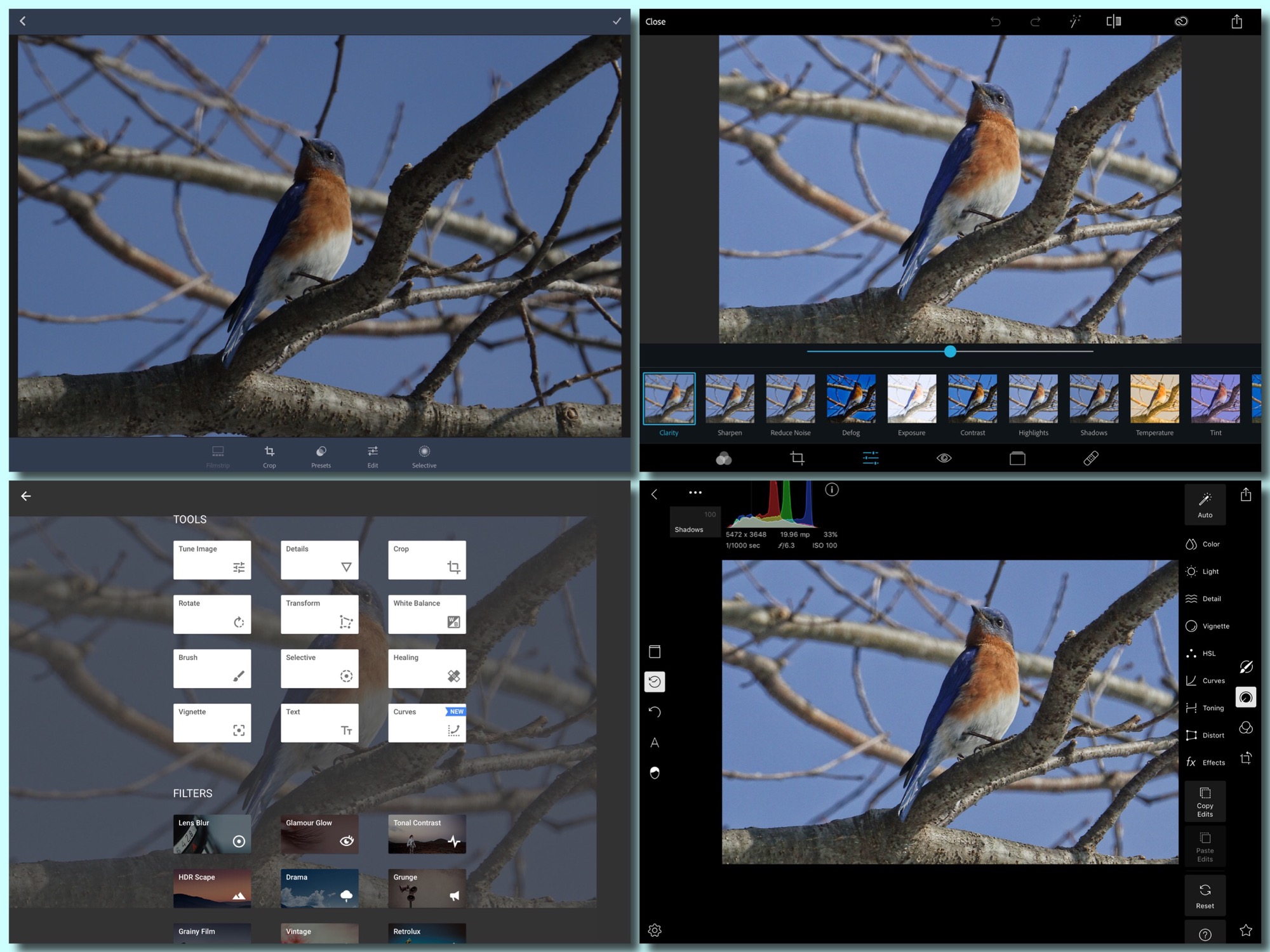
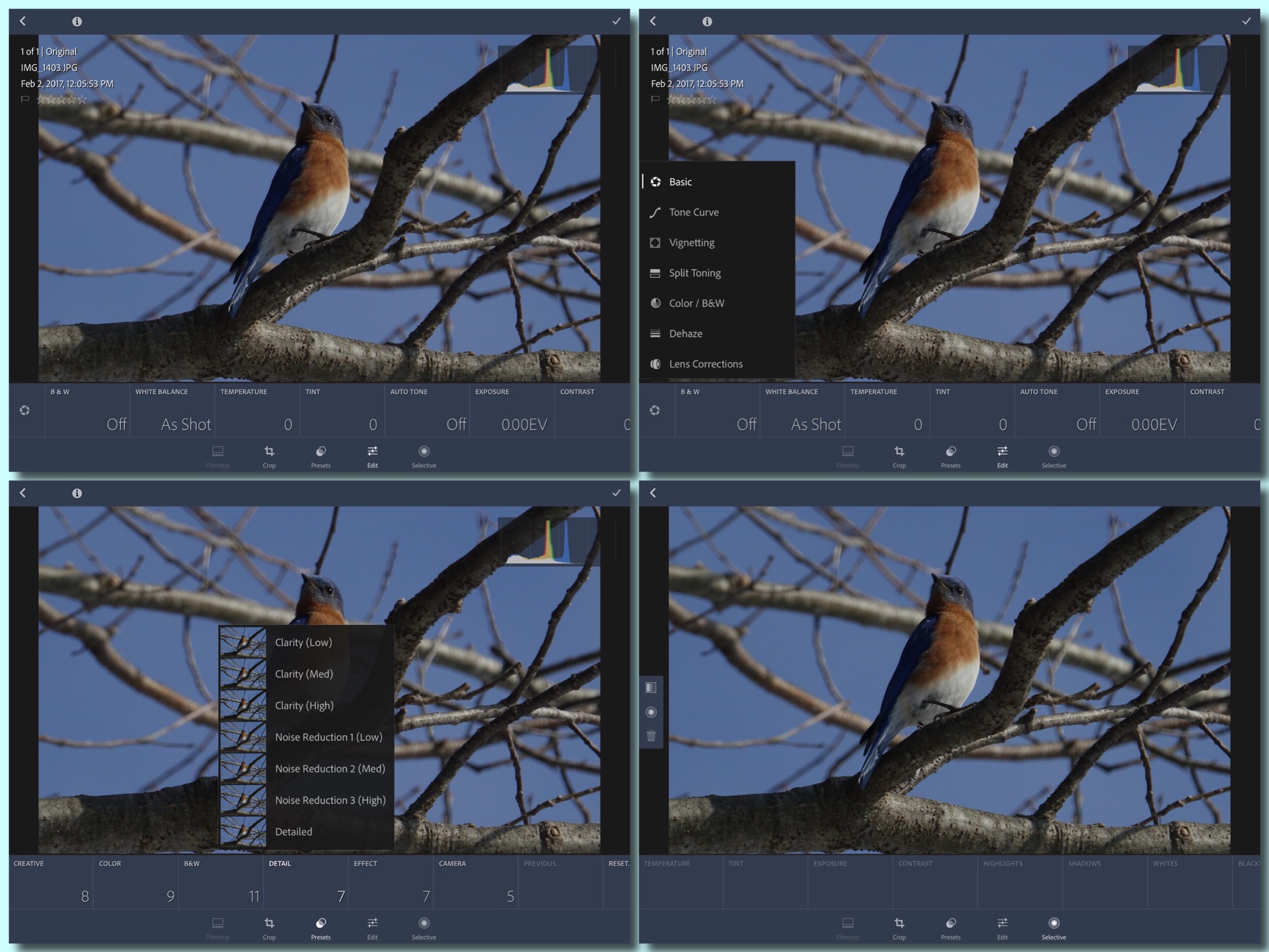
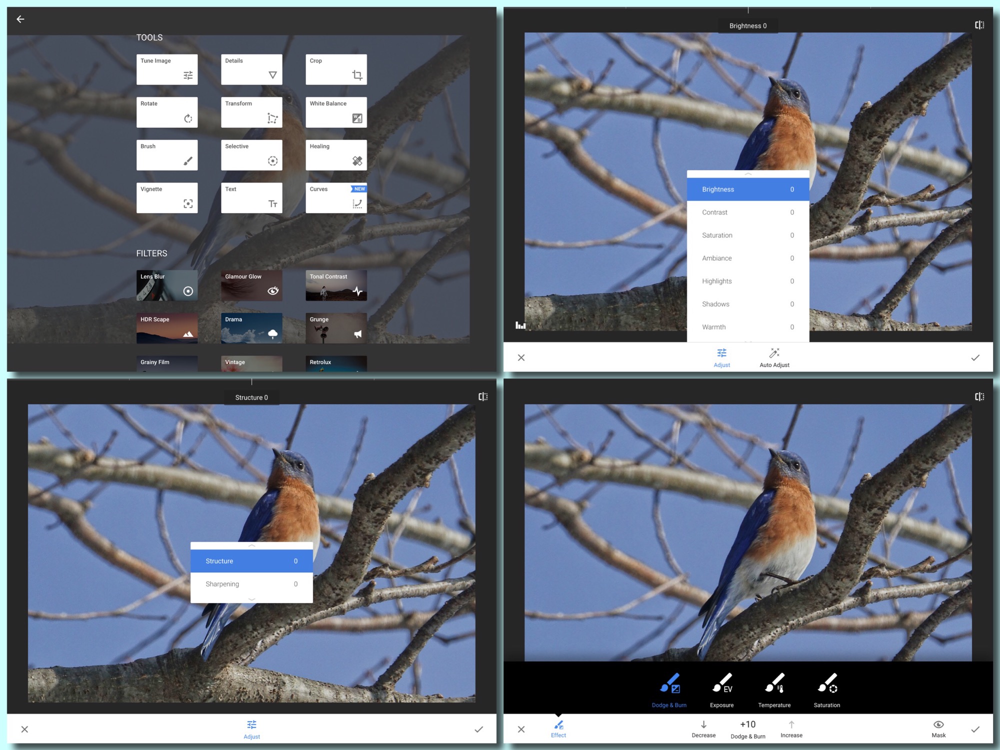
Why do you need to post-process at all? The reality of digital photography is that any good image can be made better with a few tweaks. I am going to cover the basic edits here, as they are done in the more modern apps and programs, both on the mobile and desk and lap-top platforms: Snapseed, Lightroom, PhotoShop Express, and Polarr on phones and tablets, and Lightroom or PhotoShop Elements on desk and lap-tops. You can make these edits in PhotoShop itself as well, but it might take a combination of settings to duplicate the effects of a simple slider in one of the more modern programs.
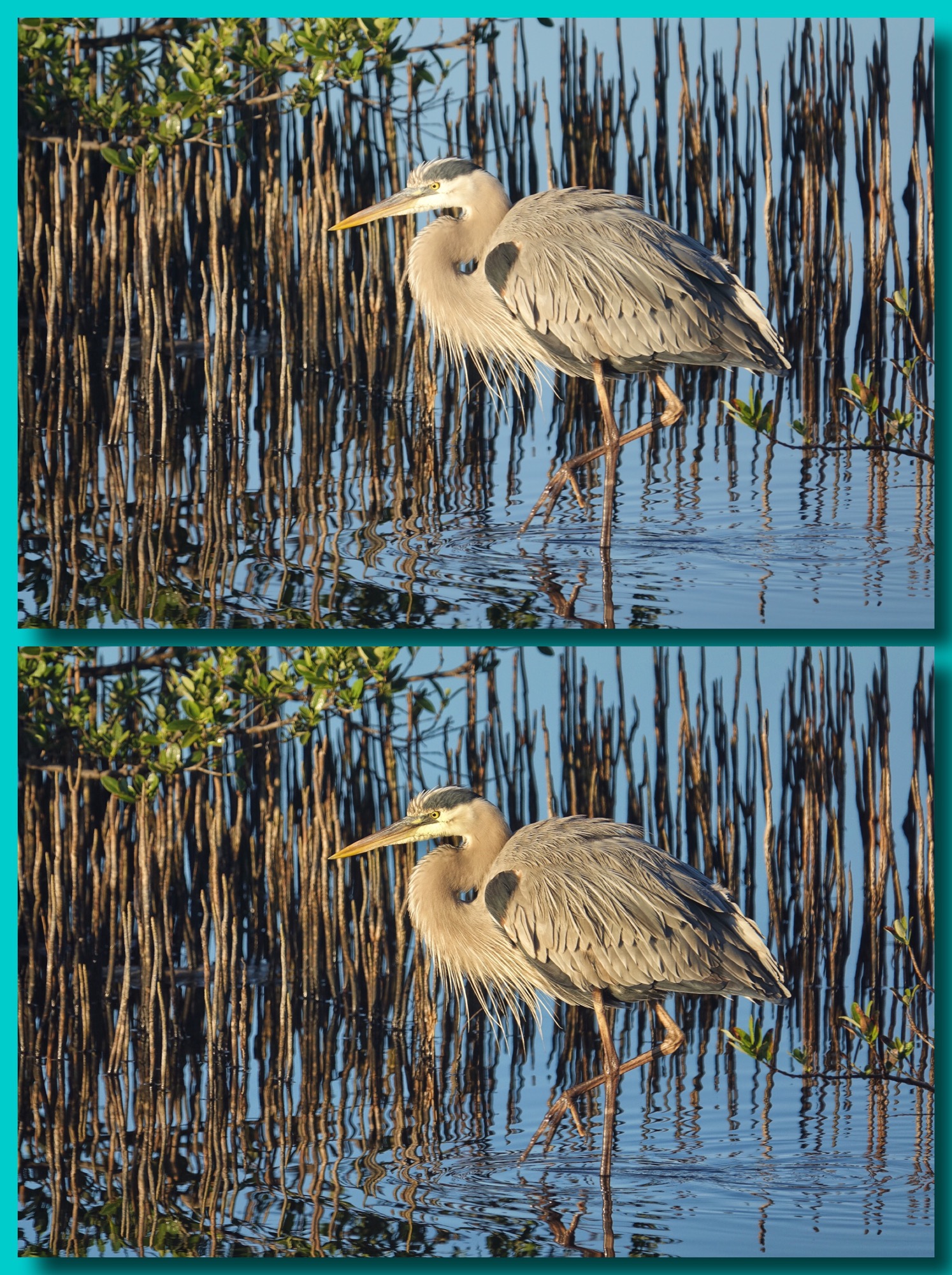
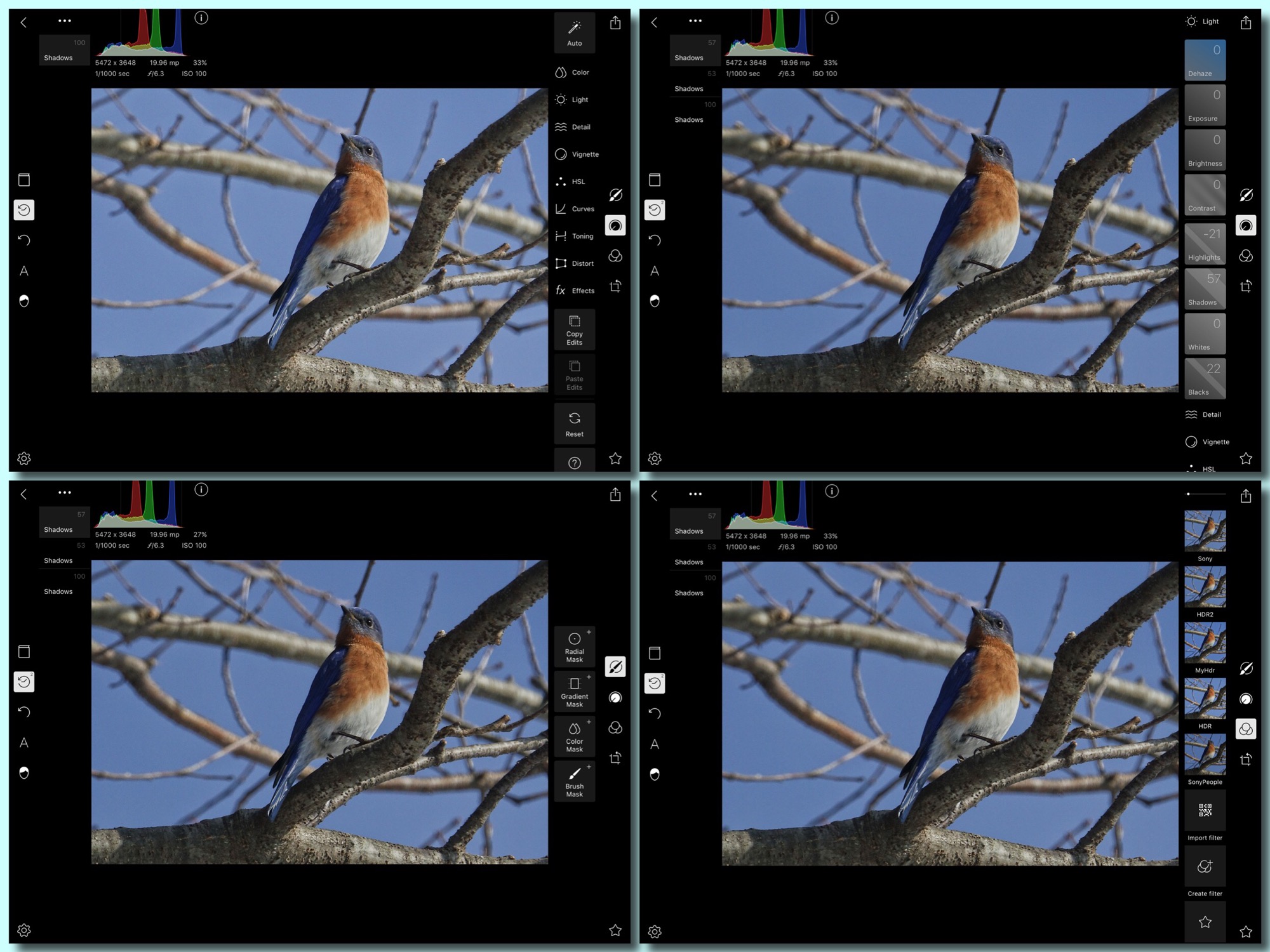
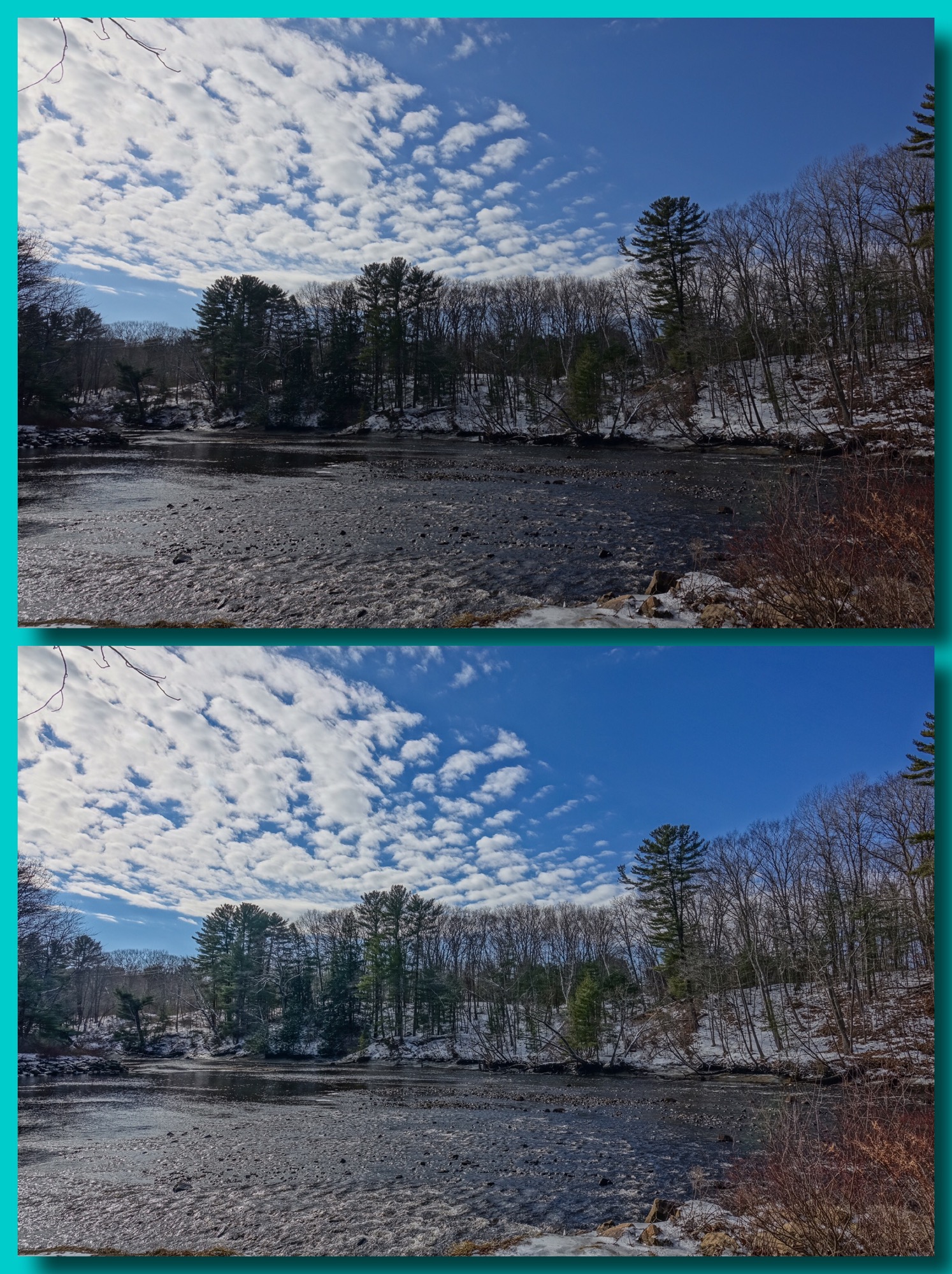
Lighting: Even a correctly exposed digital image, the shadows will often be too dark, and the highlights too bright, when compared to what the human eye sees in the same situation. The eye sees further into the shadows than the camera does, and we can see detail in bright areas that the camera will render as blocks of solid white or bright color. Cameras today have some kind of compensation for this built in, generally called Dynamic Range Control, or DR Enhansement, or iContrast, or Active D Lighting, etc. Even when taking advantage of these in-camera adjustments (and you should be taking advantage of them), there is no way the sensor can see or record the full range of light that the human eye does. By adjusting the shadows and highlights in post-processing we can produce an image that has the appearance of being closer to what our eye sees in any given situation. To improve the image we need to “open” the shadows (brighten them) and “pull back” the highlights. Not a lot, or the image will look flat and uninteresting, but some. That is the first change to make. In a traditional program like PhotoShop these changes are made with the “curves” tool. In the other apps and programs it is made with the Shadows and Highlights sliders. Slide shadows to the plus side until the shadows open to suit you. Pull the highlights slider to the negative side until you see the detail you want in the bright areas of the image. Do not expect miracles. The shadows slider will not reclaim shadows that are totally black, and the highlight slider will not restore detail in totally overexposed whites or brights…but generally these adjustments will produce a more pleasing, more life-like image. And don’t overdo either. You want the image to still have enough contrast between the darks and lights to be three-dimensional and interesting.
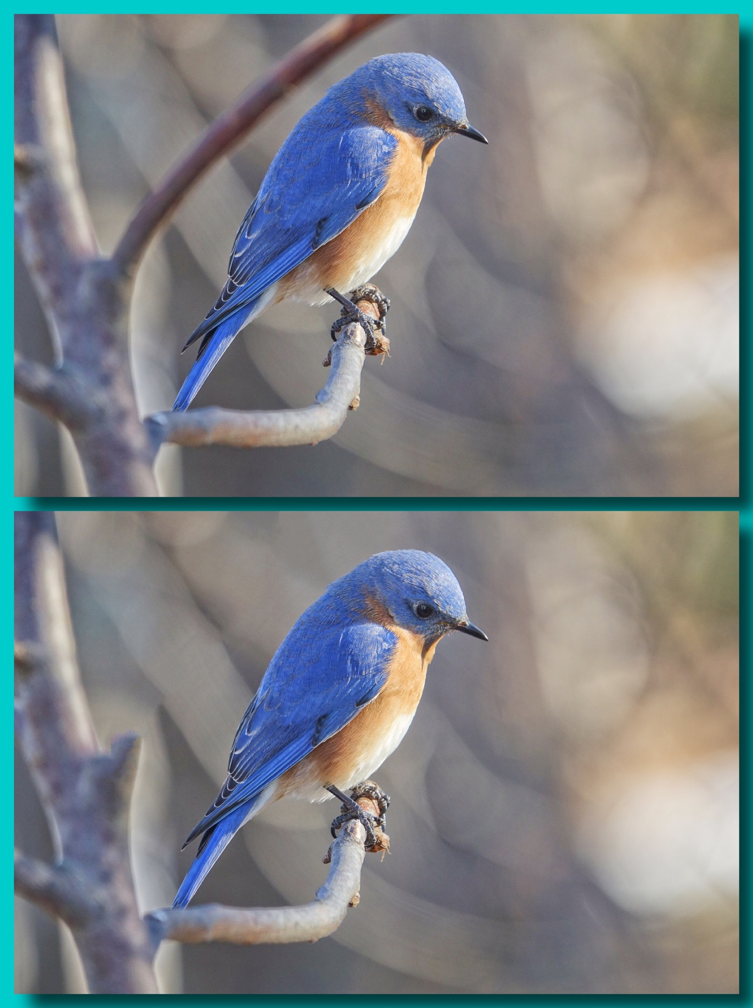
Detail: Because of the structure of digital image sensors, all digital images need some sharpening. Most cameras, when you shoot in jpeg, apply sharpening in camera. I set my cameras to apply the least possible sharpening in-camera, since it is better done in post-processing. In-camera sharpening can produce extra noise in the background of the image, and unnaturally sharp edges. The sharpening tool in most modern apps and programs applies a combination of traditional edge sharpening and unsharp masking to produce a natural looking result, with a simple slide of the sharpness slider until it looks right. PhotoShop is the exception again, where you still have separate sharpen and unsharp mask tools. Do not oversharpen! It will produce the same negative effects on image quality as in-camera sharpening often does. If an image, or parts of an image are out of focus or motion blurred, they will not be improved by oversharpening. Quite the opposite. Apply just enough sharpening to render the details in the image as they would look to the human eye, if you were at approximately the right distance to make the subject the same size as it is in the image.
The second aspect of sharpening is most often called clarity (it is called structure in Snapseed). Clarity increases the local-area-contrast of the image to bring out fine detail in hair, fur, feathers, or the fine textures of flower petals (or human skin). Think of it as controlling the “inner detail” of the image. In PhotoShop we produce this effect by using unconventional settings of the unsharp mask tool. Most modern apps and programs will have a clairity (or “structure“) slider. Again, just slide the clarity slider to the positive side until it produces the effect you want. (If you slide it to the negative side it will become really obvious what the tool is doing.) Hint: you do not want to overdo the clarity, especially in images with people’s faces in them. In fact one of the legitimate uses of negative clarity is in portraits, where you might not want to see the “inner detail” of every skin blemish 🙂 Hint 2: Increaseing the clarity will sometimes have the effect of making the whole image look a little darker. You can offset this with the Exposure or Brightness sliders.
Color: The auto color temperature controls in today’s cameras are very good. They can adjust the jpeg processing to produce natural looking colors in almost any light. They are almost as good at this as the human eye. Amost. What can be improved in most digital images is the “pop” or “impact” of the colors…especially if you have already adjusted the shadows and highlights. Modern apps and programs have a control called vibrance (sometimes grouped with clarity and sometimes grouped with color temperature and saturation…and, as always, called something else in Snapseed: “ambiance“). Vibrance looks at the image and determines which colors might be undersaturated (not rich or vivid enough). Generally these are the blues and greens, and sometimes reds. Sliding the vibrance slider will increase the saturation and brightness of only those colors that the program or app thinks need it. It will generally make the sky a darker blue, and the green trees brighter green. Or it might pick up the similar hues in a bird’s plumage or a flower’s petals. Slide the vibrance (or ambiance) slider to the positive side until you produce a pleasing effect. (And again, sliding it to the negative side will give you a better idea of what you are actually changing.) Once more, do no overdue it. If the control is adjusting reds, or purples, especially, it is easy to get the reds and purples so saturated that you no longer see fine detail in those areas of the image. And it is also easy to get the sky unnaturally blue. Exercise restraint. Again, PhotoShop (the last time I looked) did not have a vibrance slider or control. You would have to adjust the individual color channels using the curves control. Not easy to do. It is worth mentioning that Snapseed’s ambiance control has more effect on the brightness and color temperature of the image (by color temperature we mean the balance between warm tones and cold ones, red and yellow and orange being warm…just think the color of fire, and blues and blue-greens being cold), than the vibrance control in the other apps and programs. It produces almost a warm glow…which is pleasing in some images, but not in others.
To summarize, these are the adjustments all most all digital images will need, or benefit from. The amounts will depend on your camera and your taste.
- open the shadows
- pull back the highlights
- sharpen the image
- increase the clarity of the image
- increase the vibrance of the image
- exercise restraint…work for the natural look not the spectacular. 🙂
Wildlife, birds, and macro images will benefit from more sharpening and clarity than landscapes, and will not need as much shadow, highlight, and vibrance control. Landscapes will generally need more shadow, highlight, and vibrance control, and less clarity and sharpness. People shots will not like much sharpening or clarity at all (at all), and can stand only a touch of vibrance. Shadow and highlights can be effective but you need to be careful not to produce a cartoony look.
In programs that allow me too, I will set up three presets, or saved looks, or custom filter (all names for the same thing…a set of edits that are saved and can be applied with a single touch or click to the nickname). I love the way Snapseed works, and it is the one app that will run on any mobile platform (not matter how underpowered), but it does not yet have the ability to save a set of edits and apply them to a different image. Lightroom on the desk and lap-top has this ability and is excellent…but Lightroom for mobile platforms does not. PhotoShop Elements and Polarr both save sets of edits (My Looks in PSE, and Custom Fliters in Polarr). For exactly that reason, my go-to post-processing program on the desk and lap-top is Lightroom, and my go-to apps on my tablet are PSE and Polarr. (PSE for landscapes, because the shadow tool is more effective, and Polarr for everything else, since it is faster, and has a deeper feature set than PSE.)
Honestly, if you have your camera set up right for quality jpegs, you will rarely have to go beyond these basic edits…and most often will be able to apply one of your saved presets or custom filters. If you need to to more, they you really need to ask yourself if the image is worth saving. Most of the time, even with more powerful tools and more sophisticated techniques, you will not be able to produce the image you had in mind when you pressed the shutter. Sorry. That is just the way it is with digital.
One exception is the dehaze or defog control that is available in Lightroom (both mobile and -top) and in PhotoShop Elements and Polarr on mobile. The dehaze tool, like the others covered, takes care not to overdo it, but it can be effective in restoring contrast to an image that is washed out due to an over abundance of blue refracted light…as in fog or haze, or the effects of shooting into the sun. It selectively removes diffuse blue spectrum light from the image. It will also darken the image overall, so some compensation with the exposure or brightness control is generally needed, but it can improve some shots dramatically. It is never part of my basic presets, looks, or custom filters, as I only use it rarely, but it is really useful on occasion.
Another exception is what we call local adjustments. In PhotoShop to make local adjustments you have to use the selective brushes and masking. In Lightroom, Snapseed, and Polarr, you can apply them quickly and easily using specialized controls. Lightroom on the desktop has the best implementation. You can apply gradient or radial filters, or you can brush on adjustments to just a specific portion of the image. In Lightroom on the mobile platform you only have the gradient and radial options. Snapseed has radial filters and a brush, but the brush is not very fine. Polarr, on the mobile platform has the set that is closest to Lightroom desk and lap-top: gradient, radial, and and finely controllable brush. I have not found much use for a radial filter (basically round and graduated from the center) in any app or program, but I use the gradient filters on occasion to darken the sky and lighten the foreground in a particularly difficult landscape shot. You just drag a gradient over the image, top to bottom or bottom to top, and then adjust things like exposure, brightness, clarity, vibrance, etc. The effects are applied as a gradient…most intense at one edge of the image and then gradually fading to nothing at the other edge. You can actually apply two gradients (I call them dueling gradients), one from the top and one from the bottom to, as I mentioned, darken the sky at the same time you lighten the foreground.
The other local control that I do use is the brush, especially in Lightroom (-top) and Polarr (mobile). The brush allows me to decrease the brightness of, say the white patch on the chin of a otherwise correctly exposed Great Blue Heron, to retrieve detail in the feathers there. I simply select the brush control and paint over the area to be changed, then apply negative exposure. I can do the same thing with the clarity control to make the eye in an image pop. Just paint over the eye, and increase clarity. Again, I do this kind of extra editing to maybe one in 300 images.
Finally, there is one app available on iPads and Window’s tablets which does what no other will do…on those very rare occasions when the there is something in the image that just has to go…whether is an out of focus branch in an otherwise perfect composition of a bird, or beer can on an otherwise pristine beach. TouchRetouch does a better job of removing and filling than any other app I have used. You simply paint out, or lasso, the offending object, press go, and the app removes the object and seamlessly fills in the hole by very intelligently extrapolating from the surround. When it works it is magic. It does not always work. Sometimes the background is just to complex or the objectionable thing is too close to your subject, etc. But is is always worth a try when you have an image that requires, or could benefit from its magic TouchRetouch.
In my opinion, for general editing and post-processing there is no match for Lightroom on the desk or lap-top, though it does require you to import every image you want to process into its catalog. On the mobile platform there is no reason not to use PhotoShop Express (especially as it is free…though to unlock all its features you have to have a Adobe subscription). It works very much like Lightroom on the desk or lap-top, and allows you to save your editing settings as a custom My Look. Polarr is becoming my go-to image processor on my iPad Pro, because of its speed and deep feature set, and the ease with which you can save and apply our editing settings as custom filers. To unlock all features it cost $20, but that also gives you access to Polarr on any platform you might use…desk or -laptop, Andriod phone or tablet, iPad or iPhone, and even Chromebooks. It is available for them all.
So again, get your camera set up for consistently well exposed jpeg images, and apply a few basic edits in the program or app of your choice, and you will have consistently satisfying images.
thanks as always for the great tips. there is one other editing site i like: picmonkey. for me it is quick and very intuitive. it also is deeper than it first appears..anyway, just my 2 cents
fred from daytona